Thursday, March 30, 2006

Recent Surfing Highlights 6

Make $100,000 (US) a year or more as a Graphic Designer! Find out more here for this opportunity of a lifetime!.

An extensive collection of album covers designed by Peter Saville We are not worthy.

Fantastic Australian design blogsite One Plus One Equals Three posts the best t-shirt I have seen in quite a while..

Brian Eno & David Byrne's seminal album 'My Life In The Bush Of Ghosts' has been remixed and re-released with a re-worked album cover by Peter Buchanan-Smith (designer off one of my favourite album covers, Wilco's 'A Ghost Is Born'.

World's smallest cat. File under 'your cat wants protein''

Tuesday, March 28, 2006

Revenge of the Graduate Portfolio

I graduated from the University of South Australia's Bachelor of Visual Communication Degree course way back in those halcyon days of 1991, so I've been a 'professional' designer for going on 15 years now, in theory anyway. When you finish your study, you're thrust out into the working world and justly expected by any prospective employer to be ready to undertake the duties of a professional designer.

That's rarely the case though, and wasn't in my particular experience. I left University at a difficult time. Australia was in the midst of a recession, the days when you would see a design firms logo emblazoned on their company BMW were over and work was hard to come by for even the most experienced of designers. The course I did was excellent in regards to the theory of good visual communication, but was very light when it came to the business of an everyday design practice. Times were changing and the course was failing to (or at the very least was lacking in funds to) keep up with the important role computers were obviously beginning to play in the graphic design field, we all know it was inevitable as we scrambled to learn as much as we could from the few Mac SE machines available, trying to wring design gold under the very rudimentary tools set of programs such as 'Ready Set Go'.

I'm currently in the process of a big clean-out in preparation for moving house. I've tended to be a bit of a pack-rat over the years, and I've dragged out my graduate portfolio into the daylight for the first time in probably over 10 years or so. It's an interesting 'artifact' to say the least - full of all those past influences of Design heroes, letraset, bromides and cut paper. University is a time for experimentation, to find your direction as a designer, free to create without the burden of client input or budget constraints.

So how does the 21 year old graduate designer scrub up to the 35 year old 'professional designer'? Over the next couple of weeks or so I'm going to examine each of my graduate projects and review where my design sensibilities where then compared to now - the good, the bad and probably the very ugly of what I offered towards potential employers back those many years ago.

Wednesday, March 22, 2006

Judging albums by their cover 6


The Dirty Three: Whatever You Love, You Are

I look at this album cover and wonder, 'Why can't all album covers be this beautiful?' The best answer of course, is that not all bands are The Dirty Three. If there is one thing that separates them from the herd, in a musical sense, is their strong sense of craftmanship. I've been thinking a lot lately about that term 'craftmanship' about how it applies to me in terms of expression and art (designers tend to dwell on such things, I think it's a reaction against self-expression vs earning a wage).
When we're young, everyone does art at school (and usually just for the fun of it). It's the fundamental tool of learning how to express yourself, unlocking the mysteries of life through finger-paints and paddlepop sticks. It usually ends there with most people unless they have that spark or inner self determination to continue improving and experimenting with their 'art-skills' It's unusual in that it's one of the few things you partake in at an early educational level that is not carried through with. All kids play with balls, and through their years of learning, the 'craft' of physical education is encouraged, so at least you're skilled enough to kick a football or hit a ball with a tennis racket. This is the same with reading, computer skills, spelling - it just seems really weird that most people stop at the finger-paints.

As a designer - I'm one of those kids that decided to carry that journey on beyond the finger-paints, to hone 'my craft' if you will. I was never really interested in the intellectual side of 'art' when I was growing up. It was more of a matter of seeing something and appreciating the skill that went into producing it, whether that was a cartoon, a comic book or magazine illustration I stumbled upon. I never thought of myself as producing 'art' growing up - if I even thought of putting a title on what I did, it was illustration, cartooning, or just drawing - my interest wasn't in 'art for art sake' but in creating something with a purpose, my explorations were always aimed at the creation of comic books, picture books, posters. So before I even knew what I was, I was a 'designer' I guess. It's amazing how much that has influenced how I look and feel upon the visual world around me. I don't really differentiate between craft and art. I can appreciate the beauty of a well considered and thoughtfully designed annual report as much as I can appreciate the beauty of the strokes in Monet's water lilies. What is the link that ties both things together for me then? The important criteria is that they make me feel something, before I delve into whether that annual report is actually clearly defining that year's stats to the shareholders, or Monet's tenants on Impressionism, I want to be moved by them before I wish to explore them more.

Which (long-windedly!) brings me back to the album 'Whatever You Love, You Are'. The cover's Van Gogh-like use of thick paintstrokes and gobs of colours instantly draws me into further examination of the albums contents. A listen to it makes it obvious this is a beautiful album that has been well served by a beautiful cover. The painting effectively highlights the emotional expressiveness of tracks like 'I Offered It Up To The Stars And Night Skies' but is still naive and rough enough around the edges to properly serve a track like 'I Really Should've Gone Out Last Night'. The layered paint strokes are an indication of the added layers of orchestration that have been incorporated with Warren Ellis' violin, but you're still reminded that this is no grandiose symphony performance, by the subtle placement of the band's name in the bottom right hand corner.

The cover and the music are a perfect amalgamation of craftsmanship and art - both can be appreciated for the skill involved in producing them and the means in which they can move you, that rare accomplishment, an album cover that gives you the feel of the music before a note is played.

Tuesday, March 21, 2006

Designers Who Are Better Than Me 5

Grant Jorgensen has been running his studio Jorgensen Design in Adelaide since 1983. His style of design is very distinctive, idea based modernist styling that has avoided the popular modern trends graphic design in favour of a very individual visual style.

Any alumni of the University of South Australia's Bachelor of Visual Communication course will no doubt recognize the influence of Lecturer and AGDA Hall-Of-Fame Designer Lyndon Whaite. Anyone studying under Lyndon would have been reminded (probably repeatedly) about how studious and committed a design student Grant Jorgensen was. If that sounds intimidating enough, my former employer actually studied with Grant and was faced with that comparison on a daily basis.

Jorgensen Design's attention to detail has become legend amongst the design studios and print shops of Adelaide. A look through his online portfolio at his website demonstrates why. The work spans over 20 years of his professional life and even includes some work produced as a student, it all seems fresh and inspiring as if it were produced last week, a nod to the fact that good design and solid ideas will transcend the fads and whims of the passing years.

Thursday, March 16, 2006

Recent Work


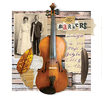
A just completed re-design for local Adelaide folk outfit The Barkers by 'yours truly'. This album was originally released a few years back, the recording & production has been cleaned up a bit and repackaged in preparation fro the band's resumption of live shows. It's a great album for those who love the Celtic, folk stylings of artists such as The Pogues, The Chieftains & Van Morrison.

I've got 3 copies of this CD to give away. Just shoot me an email (you'll find it within my profile) with your address details and subject it 'Barkers CD'

You can also purchase the album online at Earshot Music, a great little local operation that sells Adelaide artists albums online. You can listen to song excerpts and also see a few more covers I've done (and are for sale) from Round Records on the site.

Saturday, March 11, 2006

Finding Great Australian Designed Album Covers

Some great Australian album cover design examples - some even taken from that Australian Creative article I had a dig at I must admit! Please comment if you can suggest any other examples.

Mark Gowing designs covers for artists on his own Preservation Music as well as other Australian acts such as Big Heavy stuff. It looks like he was very influenced by the likes of the ECM label and the work Kim Hiorthoy has produced for the label Rune Grammofon. A nice clean style.

Jonathan Zawada has a very annoying website (it only displays certain pieces of work at certain times of the day) but a very individual design touch for someone in his mid twenties. Try here to read an interview with him and some examples of his work.

The Sopp Collective are an example of the great design work coming out of local electronica labels. A beautiful lyrical and individual approach.

I'm not sure who design the covers for Adelaide electronica label Surgery Records, but their stylistic similarity suggests it's the same person or studio. At any rate, the covers are excellent, nice to see such beautiful work coming out of my hometown.

Jazz music has always provided a welcome home for great album cover artwork from those 50's Bluenote covers to the likes of covers produced by labels Verve and the above mentioned ECM. Australian Jazz label Jazzhead follow a similar flavour with their cover artwork in a staggeringly consistent, yet creative and interesting design style to their releases.

Modular have made quite a name for themselves locally as a label that consistently releases albums that capture the imagination of the public, from the likes of Wolfmother and Rocket Science. This success is echoed in some very consistently well designed album covers, the website is excellent as well.

Does Australian CD artwork suck?

Does the design of Australian CD covers suck, or perhaps to put it a better way, does the design of Australian CD covers pale in comparison to work being produced overseas? The latest edition of Australian Creative, in one of their usual indepth critiques says 'yes it does'. The statement arises in their examination of that old chestnut, 'does the increase in consumers downloading music online mean the death of printed cover art?' I'll cover my opinions on that matter in another article - but is Australia really producing substandard CD covers? Well, the obvious answer to that is of course that 90% of everything that is designed is substandard or at the very least generic. That applies to what is being produced overseas as well, so is Australia really the poor cousin in comparison when it comes to album art?

The article makes it sound like great CD artwork flows like milk and honey in the US and Europe, a fantastic nirvana where designer's call the shots, producing cutting edge work for the likes of The Rolling Stones, Madonna and Radiohead. Funny then, that's not the impression that I get when I see the racks of blandness while walking into a Sanity record store.

The fact of the matter is that The USA & Europe are producing as much crap CD covers, if not more-so, as we are in Australia. Certainly, the likes of Stefan Sagmeister, Designers Republic & Kim Hiorthoy are producing brilliant cutting edge covers, none of it is finding it's way onto the latest Britney or 50 Cent release you'll notic though. While Sagmeister and The Designers Republic have designed covers for big acts like The Rolling Stones and Madonna, they are hardly the most creative examples of their work, could you name off the top of your head what album they did? Their best work has always been for independent record labels, even Peter Saville and Vaughan Oliver's covers for New Order and The Pixies were done under the patronage of independent labels.

It all comes down to economy of scale. Europe and the USA obviously have larger populations, are closer to other countries and therefore have more access to diverse markets. It stands to reason then, that they have a higher number of independent records labels, putting out more product and vying for a slice of the market. Australia has a relatively small population - hence less record labels putting out less product. So it would appear that there are less well designed CD covers produced here, but in a percentage comparison, the opposite is probably the case.

And what exactly does Australian creative consider as a well designed CD cover? One produced by a well known designer it seems, they don't really set any base mark for their conclusions other that citing the obvious overseas big names, Sagmeister doesn't produce work here so guess what, we're crap!

If Australian Creative were seriously interested in examining whether Australian CD artwork really is inferior compared to that overseas, they probably should have looked into it with a bit more depth than just asking the nearest 'bohemian' behind the counter at the local record shop whether he can think of any really cool Australian CD covers.

Thursday, March 09, 2006

Recent Surfing Highlights 5

Offensive Wear is an Adelaide t-shirt company with some fantastic designs by workmate Chris (whatever you're into now I was into five years ago) Cooper.

How much cooler can you get? Sneakers designed by Peter Saville.

Designsponge has an updated look. This is a great site to check out 'designer items' for the home.

Some photographers just have too much time on their hands. Check out Earth Erotica (I wonder if I should add 'not safe for work?)

A German company called Cat Interiors - the name says it all really. File under: your cat wants Phillippe Starck.

Monday, March 06, 2006

Judging albums by their cover 5


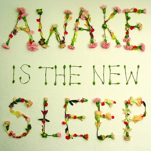
Ben Lee: Awake Is The New Sleep

What can you say about Ben Lee? You either hate him or hate him even more. Many would like to smash Lee's elongated face open, not just because he has previously claimed his albums to be among the greatest Australian rock recordings of all time, but also because of the amazing amount of crap that dribbles out of his month in every interview I have ever read with him.

I don't hate him for that, it only puts him in the 99 percentile of all celebrities as far as I'm concerned - it's the frustrating dichotomy of his existence. The fact that he's not a very good singer or musician, yet plays to his strengths and knows his limits, that he's not a great writer, yet his songs are habitually catchy and well crafted, the fact that he is not an actor, yet did a pretty good job of starring in 'The Rage In Placid Lake, hell, I can even forgive him for going out with Claire Danes and not being 'me'. No, the reason for my hate is an extremely personal and petty one, the fact that he isn't a designer, yet does a frickin' fantastic job of designing the cover to 'Awake Is The New Sleep' himself.

The cover provides the perfect aesthetic for the upbeat and likeable aura of 'Awake Is The New Sleep'. Those expecting the album to document the little bugger's breakup with Claire Danes with morbid musical strains will be disappointed. The album was mostly put together before that sad journey to Dumpsville: population Lee, when Danes decided to grab herself a large hunking lump of actor Billy Crudup, the only signs of their parting is in the bluesy tribute of Ache For You. For most of the album a chin-up atmosphere prevails, even the initial sad strains of 'Gamble Everything For Love' upon a closer listen reveals a positive affirmation of the possibilities of love. And it's all seems perfectly encapsulated with that 'so simple why didn't I think of that' cover that cuts through the pretentions that the albums title might suggest. If I was to say, it's an album cover with the title spelt out in flowers, it would sound pretty naff, right? Yet Lee pulls it off with the restraint and elegance of a seasoned design professional, bastard.

It's not a perfect album by any means, it's cheeriness overstays it's welcome by a song or two, as does that damn toy piano by about three songs in. I have to give him an "A' for effort though. Awake Is The New Sleep is a humble album that finds Lee astutely checking his ego at the door for a change. That and a fantastic cover is enough to distract me from his ugly smug mugging, ridiculous media quotes and C grade gaggle of celebrity friends for the moment, at least until he hooks up with his next Hollywood babe.

Friday, March 03, 2006

Not Very Professional


Being a Graphic Designer, I always take an interest when I come across an updated identity for a well known local brand. Usually this change is an improvement, the mark may have been in use for over a decade or more and needs to keep up with the aesthetics of the time, the company might have grown or been bought by someone new who wants to update the image to meet with their business criteria - in any case, what the business would hope for is a new mark that is at least as effective as the old one if not a vast improvement. Then you come across something like the new logo for The Professionals Real Estate and you wonder what the hell they are trying to achieve.

Their old logo (as such) was made up from a serviceable use of san serif type and those 1970s modernist parallel colour bars prevalent in the design of those times, so there was no doubt that an update was justified. What they have ended up with looks like they got the receptionist to knock it up in her lunch break (my apologies to any receptionists out there who have forsaken a career in graphic design to work front of office).

I can excuse a small business knocking up their own logo out of Publisher on their home computer to stick on a sandwich board outside their shop (well I can't really, in fact I usually think they'd be better off if they hadn't of bothered), but The Professionals are a large national real estate firm, They even call themselves The Professionals with a mark that says they are 'anything but'.

First off, is that friggin' Comic Sans that they've used for the typeface on the mark? I'm pretty sure it isn't actually, they've only managed to discover a similar typeface that is even uglier. Lots of designers use a handwritten style in logos to denote a personable, approachable personality to the mark, I guess it's like when you receive a handwritten letter, it's saying 'this is just for you'. So that approach is probably not so bad when you're trying to sell someone something as personal as a home. A computer 'handwritten style' font isn't going to do that, the whole idea is negated by the fact that it's characters are exact duplicates, for example, in Professionals you have three 's' that look exactly the same - you don't get the different nuances you would if they had actually bothered to pick up a writing implement and handwritten it.

Secondly, let's make this logo really difficult and expensive to reproduce by making it work only in five colours for the hundred odd offices around the country who will need to be able to reproduce it in one colour newspaper real estate listings, making sure that when they do it will be even uglier.

I assume that smudge at the top is a star (signifying?) - either that or their colour printers ink cartridge has leaked.

I'd be very surprised (and embarrassed) if a dedicated design firm produced this - I'm assuming the Managing Director's 8 year old son brought it home from art class and hung it on the fridge just when daddy was looking for a new identity for his firm. If this was produced by a designer, then they must have the biggest balls imaginable to get this through, either that or it's meant as irony (I just can't tell anymore).

Designers Who Are Better Than Me 4

Do-Da probably have about the best name for a design firm I've come across (Bitch Design would be up there as well). The Director and owner of Do-Da is affable chap Gavin Klose, Gavin was a year ahead of me at University, I remember when I was in third year, a trip to the next room for a chat and a look-see at what Gavin was working on was a great way to get your arse into gear and actually do some of that creative stuff we were studying. Even back then, Gavin had an excellent work ethic based on a quirky organic design style and an attention to detail which has carried through to this day. When I come across a piece of design locally that demonstrates a big idea with a left of centre execution, it's usually been produced from the studios of Do-Da. Their website demonstrates a nice range of projects - my favourites being the identity for Cibo Expresso - an establishment that has become synonymous with the Adelaide 'coffee drinker scene' (is there a coffee drinker scene?) and the Annual report for Bedford Industries, a beautiful, simple solution for a sensitive product. So take some time to browse the portfolio over at Do-Da and be inspired once more by some of the great design work being produced in little old Adelaide.