Monday, November 20, 2006

Judging albums by their cover 9


Beck: The Information

Beck has always been an advocate for the use of strong, clever visual solutions for his music releases, apparently growing up, he used to pick up albums based on their cover art as well :) His latest release 'The Information' takes it up another notch. This clever little package design contains a set of stickers that allows you to customise your own cover. Art directed by uber album design specialists Big Active, over 20 image-makers were involved in the creation of the sticker sets. It's a fun idea to 'value add' the physical CD in this day and age of easily down-loadable music - the listener becomes an active participant in the album experience. So the CD package is cool, but while I was in London I managed to pick up the 7-inch vinyl single of 'Cell Phone's Dead' (the revival of the vinyl single in Europe is another story) that also contains it's own set of stickers, along with a larger cover 'canvas' to display them on. I imagine out there somewhere you can also purchase a 12-inch full vinyl album. So while this is all pretty clever, I imagine it's the sort of thing that will only effectively work once, it opens up a lot of ideas and possibilities for value adding CD packages in the future though. One of the first things I thought of when I got the Beck CD was that it was a pity that the stickers, once stuck down, are so permanent, wouldn't it be cool if they were like those old 'colour-form' kits from my childhood (I had GI-Joe and Evel Knievel sets!)that let you take off and re-place the stickers over and over. How about a set of rub-down 'letraset' images or a cover that works like a magna-doodle set? It's highly likely that the future of physical CDs lies in different areas of thought like this. There's a contest online for the best 'Information' covers put together by listeners here, oh, and the actual music on the album is pretty good too! Go out to your record shop and buy a copy.

Tuesday, November 14, 2006

Interview with Value & Service

So I went for a trip overseas a little while back (which I may have mentioned once or twice on here:) Anyway, I figured while I was over where ever I found myself, why not see if I could drop in and see a few designers whose work I admired? Easier said than done of course, many were asked, a few replied and some even said I could come and see them. London was particularly tough (maybe I shouldn't have said I was Australian?) A few replied and very politely said they would be too busy or not in the studio when I would be there. Luckily one of the studios that I did really want to visit said yes, that being Value & Service. Value & Sevice was established by Directors Sean Murphy and Hazel Rattigan in late 2002. I know the term 'thinking outside the box' gets thrown around a lot, especially in design circles, but I had been really impressed by just how different the studios work was to just about everything else out there. They really take a considered approach to the use of materials and unique solutions to their projects in a real world setting, not just a design for design sake environment. I wasn't really sure what to expect when I visited their studio is Shoreditch, what I found was a very down to earth group of designers pushing the boundaries of their profession but still dealing with the day to day challenges of running a professional studio. I spoke to director Sean Murphy.

Chris Bowden: What first inspired you to get into Graphic Design?

Sean Murphy: Believe it or not, there's a program you might have heard of, a soap opera called Eastenders, there was a character in it called Colin who was a graphic designer and I quite liked the sound of the job, the term 'graphic designer' sounded quite interesting, I always wanted to be a TV camera man before I wanted to be a designer, so I wanted to be a graphic designer before I really knew what it was. I was always quite good at art and liked drawing. Rather than doing A-Levels which is what most people in the UK do, I went straight into a Btec in graphic design.

CB: From there you went onto further study at a University?

SM:I went from there to Central St Martins and that's where I met Hazel, we worked together quite a bit at university, I left and Hazel went on to do an MA, I started working at North which is where I met our neighbours upstairs in Bibliotheque. I then went back to university to do my own MA as well, and about three and a half years ago, Hazel and I set up Value & Service.

CB: Your folio contains quite a bit of work for artists, galleries and arts organisations, was this a conscious effort on your part to work in that area?

SM: It's not something we planned really and it's probably something we're trying to change a little bit, we've got that so well covered now, and it's not an area that generally pays very well! So we want to change what we're doing in some ways, we still enjoy that kind of work, of course, it depends and what you're doing at any given time. We've just finished a book for an artist named Trevor Appleson, and in fact, we're just about to start another one for him.

CB: Do you think that sort of work offers you a lot of freedom or do you feel restricted by working under the particular aesthetics of the artist?

SM: In some ways it's actually more restrictive than more 'corporate' work in a weird sort of way. It depends who the client is though, we've worked with a curator called Tom Morton quite a bit, and he's really good, he understands what we do and allows us to get on with it, he values it, he's not one to stick his oar in in a sense. It's a two way thing, the work always comes out of our conversation with him, rather than him dictating or us dictating. That's a nice working relationship, when we first set up Value & Service, he got us to do some work on a one day art show he curated and he then went onto setup a one year temporary gallery and we were involved with that. He then went onto be the curator at a gallery called 'Cubitt' and he's brought us along with him. We've been quite lucky in who we've worked with, because they've all been quite open to our input, they've not had that idea that they tell you what to do and you just do it.

CB: I guess the good thing about working in London is the amount of fine art related enterprises there are.

SM: There's a multitude of galleries and artists, there's always something going on in that area, like the Freize Art Fair which is quite a big deal, because we've done some work in that world, we're beginning to understand that just about everyone wants work for free or at least to pay very little for it.

CB: Of all the projects you've worked on, do any stand out as being particularly memorable or enjoyable to work on?

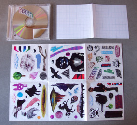
SM: It changes all the time. Sometimes you're really happy with something and other days you look at the same piece of work and see the faults in it. There's a couple of things that I really like because of their simplicity, they tend to be some of the older stuff. We did a window for Selfridges that I think is very us. There was no brief essentially, the concept was a window display based on window displays. We photographed different things around London, bits form McDonalds, dry cleaners, just anything really that caught our interest. We then recreated it, mostly in vinyl and we used suckers and things you would find in windows. The project came about through Creative Review magazine, we were chosen as one of the design firms featured in their 'Creative Futures' annual feature. That year as part of it you got given a window to design. Another project that stands out is one we did again for Tom Morton. It was an invitation to a one day art show, it was a quick idea, we cut up copies of Vogue magazine and took the pages that were purely advertising on both sides and used that as our base and just laser printed information on top of them. It's probably the lowest budget job we've ever produced, it cost about 30 quid to do, and it's one of our favourites. Things like an identity we did for a one year temporary gallery, a set of business cards on a tear off pad, there's just something about the feel of it we quite like. We were probably a bit more free with our design when we first started out, now we've got overheads to worry about!

CB: With those concerns, how do you keep yourself motivated and inspired?

SM: Depression?! It's hard to pinpoint anything exactly, mainly just by observing the things around you.

CB: Do you draw any inspiration from any of the artists you work with?

SM: I don't feel like the work that we do is directly influenced by any of the artists we have worked with. I think it's more from things like our collection of old books, lots of typographic oddities and such. We find inspiration everywhere, not particularly in one place, we might find it by looking at someones photographic work or what not. Sometimes it's a good idea to look backwards!

CB: You've mentioned that you're looking to broaden your work outside of the arts, what sort of work would you like to do?

SM: More art direction. We feel there's a bit more scope to do interesting things working with other people to create imagery, it's the sort of work we enjoy doing. At the moment we feel as though we've been getting work that just needs to be 'put together'.

CB: Would you have an ideal client you would like to work for?

SM: Comme des Garçons would be pretty ideal for us. Someone who does very interesting stuff that doesn't just follow the conventional route.

CB: There's a lot more opportunities to do that sort of work in London and Europe as a whole I guess?

SM: There's a hell of a lot of designers here as well though and each year design companies sub-divide and designers split off and start their own firms, plus a plethora of students leaving university who are really good, there's a lot of competition.

CB: What do you know about Australian Graphic Design?

SM:
I've seen bits. I'm not good with names, so I couldn't name anyone in particular, but I've seen a few magazines that have come out of Sydney that have been quite interesting. There seems to be stuff going on in Australia now whereas you would never see anything, but now you do see quite a bit in magazines or whatever, mags like Grafik or Creative Review, you see Australian designers have submitted work. I think there's some nice work coming out but I couldn't tell you who did it though!

Thanks to both Sean and Hazel for sparing the time to talk to me and show me their studios and work. All the pieces discussed in the interview can be seen on the Value & Service. website, a nice piece of work in itself, along with the rest of their portfolio.

Monday, November 13, 2006

Designers Who Are Better Than Me 12

In case you've been thinking I've given up on looking at the local design scence, what with me swanning around world, think again as I delve into the creative cauldron of Adelaide to pick out another fine design studio to bring to your attention. Detour. are a design firm I've been meaning to present here for a while, I thought they actually didn't have a website, in fact they've probably had one for a while, while I was looking for the company name followed by a .com.au, they were there all along hiding under a .net.au! Detour have been in business for what must be going on for 14 or so years now, which is a lifetime in the competitive design market of Adelaide. The studio is run by Catherine Bell and Abra Remphrey, Abra is of course, married to Parrallax head honcho Matt Remphrey - with that sort of design influence, their daughter is going to turn out to be the next Sagmeister or perhaps she'll be overwhelmed by all that designy-ness in her life and opt for a career in something more lucrative like real estate or blogging. Anyways, the Detour site has an interesting and easy to navigate interface made up of a grid of coloured boxes that you click on to reveal the studios work. Some nice work there is too, highlights being some great labels for Hazyblur and Oldfellows wineries, The Banksia Pallative Care Annual report and a really beautiful and appropriate package design for Lanapelle wool rugs for infants. Detour are a part of the pack of Adelaide design firms that stormed into the Australian Graphic Design Awards this year to pick some well deserved gongs, so spend some time and take a look.

Thursday, November 02, 2006

London Design Museum


So when In London, taking in the sights, where is the obvious first thing a designer should visit? Being a designer and all I figured a visit to the Design Museum might be in order, asking my partner Caroline if she would like to attend she replied that she would rather force matchsticks under her fingernails, so taking that hint, I set off on my own to this shrine of design. For a museum of design, I've got to say that the facade was pretty uninspiring, at least the locale is pretty, right besides the Thames in view of The Tower Bridge. It cost 7 quid to get in, which kind of put me off purchasing anything in their gift shop, as impressive as it was - I had my eye on a design museum t-shirt until I saw that they were 40 quid, which is, I don't know, about a thousand dollars or something in Australian dollars:)


One of the special displays that had on was a show on Formula One Grand Prix, not really my area of interest I've got to say, though they did have a car on display that I had as part of my Scalectrix model set when I was younger. At this point I was probably more interested in how that had set up their exhibits, graphics wise, rather than studying the intricacies of an exploded view of a McLaren F1 engine.


The main display area was dedicated to a sort of history of UK graphic design (though a pretty condensed version admittedly). I'm not sure whether this is on permanent display or not (is there anything on permanent display here? There were some beautiful WW2 deco inspired propaganda posters. This sort of illustration seems to be a lost sort of style these days, more is the pity. Best of all, there was a (small) display dedicated to Peter Saville's Factory Records work, including the original 'floppy disk' inspired sleeve for the 'Blue Monday' single which I've seen in books plenty of times but never in the flesh as it were. There was also a nice display of old penguin book covers, Penguin seems to be quite the flavour of the month as far the design blogospehere, maybe it's due to the book that was release on Peguin book design a little while back, it's good stuff, One Plus One Equals Three has a link to a Flickr photoset if I have at all piqued your interest.


The museum was filled with bored looking school students plodding through displays, filling out obligatory class set assignments, occasionally a teacher would tell one of them that they had spent enough time on the 'playstation' display and they would plod off bleary eyed into another nook of the gallery. That's about it as far as what is in the museum, ok I guess but hardly worth the £7 entry fee, pity I wasn't there a month or so later to check out the Alan Fletcher exhibition.


Being in the vicinity, and a little disappointed with the Design Museum, I figured I'd take the half hour stroll down to the Tate Modern. Caroline had expressed a slight interest, but was fearing that she would be forced to view, as she put it 'blank canvases with a pile of pebbles underneath it' which to me sounds like the most fantastic idea for 'fine art' I've heard in a long time which I intend toimplementt and enter in the Turners as soon as possible. Anyway, it was a nice day for a stroll (for a change) and the view along the Thames on the way can' be beat. The walk took me past Shakespeare's Globe Theatre, a replica that is built kind of pretty close to where the original was built. Did you know that Shakespeare's first Theatre was called the Curtain and was built on the other side of the Thames. When the landlord wanted the land back, he took it apart and rebuilt it across the way.


The Tate is going through a lot of renovation work at the moment, which means it's looking kind of crappy. The great entrance hall space was being transformed into the biggest and loopiest slippery dip of my dreams that I had ever seen, even though it was still under construction, don't think I didn't ask if I could take a slide down that baby - denied! It is art after all. Once again, the exhibit graphics are excellent, I really like the entrance wall to the 1945-1960 artists section, decorated with artists signature on a black background, really striking. The good thing about the Tate is that entry is a donation,(so free then for me :) the bad thing about the Tate is that it was full of more bored school kids with an even greater area of boredom to trod through (and no playstations!) The thing you find about London is that they really hate you taking photographs, especially if there is a buck to be made from preventing you from doing so. In mostcivilizeddplacess in the world they put up signs that say 'No photography' if they don't want you to take photographs, in London they just prefer to hire people to yell at you. So I'm in a gallery with some of the worlds greatest modern art on display, a good place to take a couple of snaps you say? Apparently the fear is that you will go in, take photos of that Rothko on the wall, run it out onto a canvas, claim it as your own and sell it. I can see how they have to be careful and once again I'm sure it has nothing to do with the prints for sale in gift shop. So I'm in there happily snapping away, actually at this point, more interested in how they hadappliedd information graphics to the walls than the actual works of art. I was getting the look from people around me, that look like I had just strangled their kitten or something, had | stepped in something, maybe a piece ofavante garde artinadvertentlyy? From out of nowhere comes a screaming banshee of a woman, for awhile I thought it was aperformancee piece of some sort, but then I realised she was with the gallery. 'No photography, no photography! She wailed like a pair of cats fighting on a tin roof - now I was on display at the Tate - the school kids certainly took more interest in it than the nearby Bacon (Francis, not in the cafeteria). London always brings the worst out in me temper wise, I'm usually pretty relaxed, but there's a way that normal people handle things like this, they politely tell you there's no photography allowed, you apologise and you're on your way, then there's the London way of being as rude as possible and drawing the most attention to yourself. I told her this in not so many worlds after she had finished screaming in my face - I may have added that dental hygiene was now a cheap and readily available commodity as well. I guess that's probably what led to me being goose stepped out of there by a couple of security guards soon afterwards, hence the rather light on review of the Tate, but by all means, if you're in the area, take a look, it's free after all :)