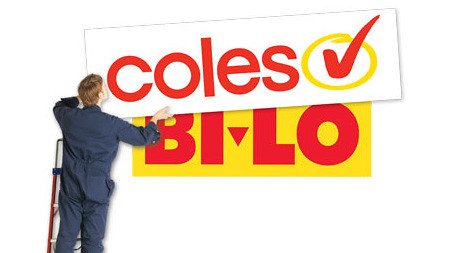
One of the first big identity projects I worked on back in the day was a re-branding for BI-LO supermarkets back when I was working at Woodhead Firth Lee (now simply Woodhead). I was pretty fresh out of University, working there on a freelance basis, so it was an exciting opportunity to re-establish what had been a reasonably well known local supermarket chain into a national franchise.
Their identity, such as it was at the time, consisted of the word BI-LO set in whatever chunky sans-serif the signwriter had (or could paint I guess) stretched and condensed to fill whatever sign dimensions as needed. BI-LO were a discount supermarket chain, the emphasis being on cheap here and at the very least it certainly demonstrated that in the face it showed the public. If it was going to branch out into other states and compete on a national level, it certainly was going to need some sort of re-branding.
It was something that were loathe to change in any dramatic sense, this look had served them for the last 20 years or so and had seen them through some success in South Australia, the bean counters were obviously thinking, why bother? The firm I was working for, Woodhead, were primarily Architects and Interior Designers, the graphics department had come into being as a natural progression to provide a more value added service to their clients - the BI-LO account I'm sure was won on the basis that Woodhead had the capabilities to design and furbish a big roll out of stores around the nation. The groceries buying public was becoming some what more canny in their preferences, though they still wanted cheap groceries, they also didn't want to wade through uncomfortable surroundings to do their weekly shopping, the stores needed to be able to compete immediately with the multitude of supermarket chains in the other states.
I'm not sure the mark itself was even part of the initial consideration for the furbish, it was obvious when the project got underway, that some consistency would need to be established with the mark to tie in with consistency on the store interior designs. Also, if there was ever going to be a time to look and establish the stores identity mark, this would be it.
The first think we did was to establish a consistent look to the mark. This was set in a Helvetica Black, tweaked in places so the logo looked more unified, and also prevented third party contractors from the urge to simply setting the 'logo' in type and stretch and condense it, rather that using the actual mark. The main change was to change the normal hyphen into a downward pointing triangle, to denote 'low prices' directly in the mark and to also give it some uniqueness and personality. Truth be told, note many people notice this until it's actually pointed out, but then again, most people aren't seriously studying corporate logos in too much detail, how may people notice the joined together 'm's' in The Commonwealth bank mark, or the arrow in the FedEx logo? For such a small change, I remember at the time it caused a bit of controversy, BI-LO had become part of the Coles Myer group and had significant asian backing, apparently in some asian cultures the symbol of the triangle pointing downwards signifies loss of fortune!
It did eventually all get through though, the mark became the basis for a whole range of identity items. I was pretty happy to have an identity I worked on rolled out on a national scale. Today, BI-LO is one of the nations best known 'discount' supermarket brands, but not for long. BI-LO has been incorporated into the Larger Coles chain and the mark is gradually being replaced by the eponymous Coles tick mark.
So it's with some melancholy I see it go, I'll miss pointing out signs where they haven't followed the design guidelines (such as placing the word 'supermarket' into the yellow banding box!) and being able to point out to people easily something that I have designed. It's inevitable of course, as designers, nearly everything we work on has a limited lifespan, the BI-LO isn't completely gone as I see they are still going to use it on some instore items - I'll miss seeing those big yellow and red signs though!


