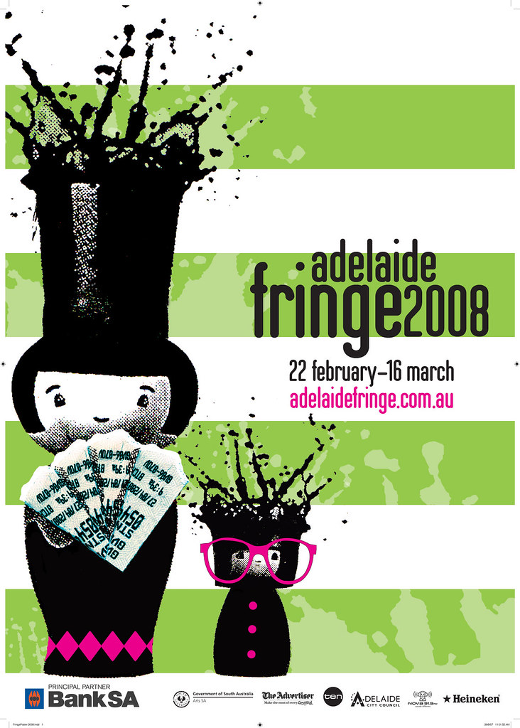
Adelaide Fringe 2008 Poster

Having reviewed the poster design for Adelaide's forthcoming arts festival, it would be some what remiss of me to not also take a look at the poster for Adelaide's other big arts event, The Fringe. As always, the poster was decided through an open design contest, this year's winner was Hat Morgan. While I haven't always been that pleased by the poster contests results, you can say that at least the winning poster is usually fun an colourful whuch I guess goes a long way to putting the appropriate face on such a lively and popular event. I think Hat has done an excellent job this time around. There's nothing too cereberal about the 'mind-blowing' image, it's quirky but not so much as to be off putting to the average punter. The two characters on the poster are quite iconic and usefully versatile when translated to other mediums such as TV spots and online applications. I like the way Hat has gotten across the 'mindblowing' image without being out-there gross or cliched, it hasn't been rendered in a trendy, fashion-following style, but follows it's own unique path. I'm not entirely sure the green stripes add much to the design, I imagine a bit of space around the figures would have only added to their impact, and the type feels a little design-school default in it's choice of font and setting. These are pretty minor quibbles though, overall I think it succeeds and portrays the Fringe as an exciting and much anticipated event.
Labels: Adelaide Fringe, Hat Morgan, poster design

