AGDA Awards
This years Australian Graphic Design Awards Have been announced and will be presented in my good ol' hometown of Adelaide. They've taken an interesting and some might say, controversial approach in their call for entries promotion - here is how the awards website describes the concept:
It has been said that the only people who bag Adelaide are those who have never been there and those who have never left. When the Victorian Premier, John Brumby, dropped his famous “backwater” comment about Adelaide, blog sites lit up with all manner of interstate opinion about our little town. Nine of the most popular opinions were taken directly from these blog sites, posted by real people, and given to Adelaide artists to interpret. Yes, we know that Adelaide can be a little weird, but that’s what makes the place interesting. We also enjoy having a laugh at ourselves.
It's true, Adelaide seems to be the butt of jokes for the rest of the nation, especially those darn eastern states highbrows! :) What the denizens of Melbourne and Sydney often fail to realise is no matter how much you keep telling everyone how cultured and sophisticated your town is in comparison, it doesn't actually make it so. In Adelaide, we just tend to get on with things and leave the bravado to those with the insecurity problems! We can take it, how about the rest of you guys?
Anyway, the promotion for the awards came to members by way of one of nine A1 posters created by Adelaide artists, shown here with the 'quote' they based the artwork on. All the images were taken from the AGDA site and are of course © to the respective creators.
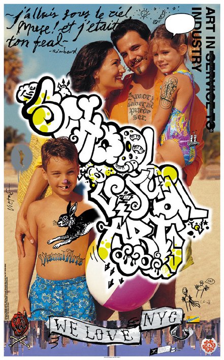
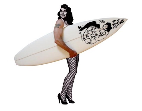
 Daniel Noone
“Ah Adelaide, ya gotta love it, like a boring relative. A quaint little stop over on way to Perth. Full of Church’s, Fish’n Chip shops and Lesbians.” Posted by: Brad of Syd
I'm sure this poster looks great and lush at full size, it seems a very Advertising Awards solution which may not be a bad thing, it reminds me of something they might have done a few years ago, though the days when an image like this would truly shock anyone are long past.
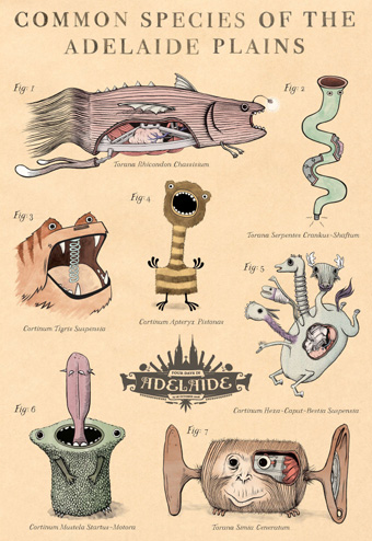 Sam Barratt and Chris Edser
“No problems with Adelaide. I go there whenever I need Torana or Cortina parts.” Posted by: Bobby Bling of Bris Vegas
This is probably my favourite of all the posters and the most difficult of all the quotes to illustrate. Sam and Chris have run with it and created a wonderful, leftfield concept incorporating imaginary creatures that are 'unique' to Adelaide, unpretentious and fun.
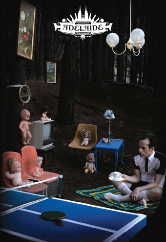 Samantha Jarrett and Mash
“Adelaide is like that pathetic friend you can’t get rid of. Sure you go to his house ‘cause he’s got a ping pong table, but he’s a loser and a bit weird!” Posted by: Boxed Head of Ballarat
A great photo and really captures that 'not quite right' quality of the quote and an 'otherness' that Adelaide seems to embody to the rest of the country. No surprise that Mash are involved with the concept, as they seem to be becoming masters of portraying a uniquely Adelaidean off-kilter design aesthetic, ie: their work doesn't look like it could come from anywhere else.
 Danny Snell
“LOL ... you must be kidding! Beautiful, peaceful Adelaide? That’s why it’s got the nickname “The Murder Capital” of Australia! SA’s you are pathetic bogans!” Posted by: Samantha Jones of Melbourne
Danny Snell is one of the best illustrators in Australia, and he doesn't disappoint here. You don't often get to see his work on such a large scale, so this must look fantastic at A1.
 Benzo
Benzo
“Cost of living is low, drug supplies are high.” Posted by: Wildcoug of Adelaide
Interesting style and nice inclusion of the eponymous Adelaide icons, the frog cake, Farmers Union Iced Coffee and Pale Ale. I really hate the shadow silhouette around the edge of the artwork though.
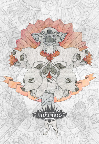
 Nahum Ziersc
“The city that always sleeps.” Posted by: Ron of Sydney
My least favourite of all the concepts, this style of illustration just does nothing for me, and I'm not sure I see the connection between the quote and the artwork - I'm probably in the minority there though!
 Fontaine Anderson
“Adelaide is like an annoying small dog that yaps, barks, jumps around and makes alot of noise about nothing, trying to be like a big dog.” Posted by: Vic of Melbourne
I love Fontaine's artwork, but there's something about this that doesn't quite gel for me. There's obviously a lot of work gone into it, maybe it comes across better viewing it at full size.
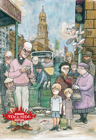
 John Engelhardt
“Thought people in Adelaide were living proof Tasmanians could swim.” Posted by: The Swanny from Sydney
John Engelhardt is quickly becoming one of my favourite illustrators and pulls off a blinder with this fantastic single colour illustration. I would say he had the hardest quote to illustrate and executes it beautifully. I want him to design my full back tattoo when I finally become senile/pathetic enough to actually get one.
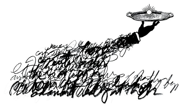
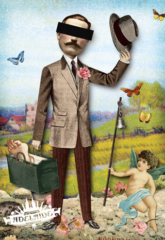
 Timothy Ide
“It’s pretty much a small going nowhere town with a lot of dark seedy murders/child mollestations/rock spiders/ etc etc not the sort of town one would move to in a hurry. It has nothing going for it and is boring and gossipy. Turn the clock back to the 80s is what this boring town is all about. Who wants to go there? Delta Goodrem’s mother lives there and Lleyton and he’s a mindless jerk. Who else? A few nobody celebs might call Adelaide home. Why is anyone’s guess.” Posted by: Vic lover of Vic
There's always been something a bit creepy about Timothy Ide's work, so he seems the perfect choice to illustrate probably the most controversial of the quotes, he falls just short of crossing the line. If any of these pieces are likely to raise an uproar, this one's it.
So there you have it, at the very least, some nice illustrations and a pretty interesting concept. Kudos to Voice as well for their 'boots 'n all' logo for the event, at first I thought it looked too 'alchohol promtion' but it has since grown on me.
If this has picqued you're interest in the Awards, you can get all the details at the AGDA website. It's always an interesting event, despite there being too many categories, too many awards, too many judges, too self inclusive and too damn expensive to enter - but that's another article! :)
It has been said that the only people who bag Adelaide are those who have never been there and those who have never left. When the Victorian Premier, John Brumby, dropped his famous “backwater” comment about Adelaide, blog sites lit up with all manner of interstate opinion about our little town. Nine of the most popular opinions were taken directly from these blog sites, posted by real people, and given to Adelaide artists to interpret. Yes, we know that Adelaide can be a little weird, but that’s what makes the place interesting. We also enjoy having a laugh at ourselves.
It's true, Adelaide seems to be the butt of jokes for the rest of the nation, especially those darn eastern states highbrows! :) What the denizens of Melbourne and Sydney often fail to realise is no matter how much you keep telling everyone how cultured and sophisticated your town is in comparison, it doesn't actually make it so. In Adelaide, we just tend to get on with things and leave the bravado to those with the insecurity problems! We can take it, how about the rest of you guys?
Anyway, the promotion for the awards came to members by way of one of nine A1 posters created by Adelaide artists, shown here with the 'quote' they based the artwork on. All the images were taken from the AGDA site and are of course © to the respective creators.
Daniel Noone“Ah Adelaide, ya gotta love it, like a boring relative. A quaint little stop over on way to Perth. Full of Church’s, Fish’n Chip shops and Lesbians.” Posted by: Brad of Syd
I'm sure this poster looks great and lush at full size, it seems a very Advertising Awards solution which may not be a bad thing, it reminds me of something they might have done a few years ago, though the days when an image like this would truly shock anyone are long past.
Sam Barratt and Chris Edser“No problems with Adelaide. I go there whenever I need Torana or Cortina parts.” Posted by: Bobby Bling of Bris Vegas
This is probably my favourite of all the posters and the most difficult of all the quotes to illustrate. Sam and Chris have run with it and created a wonderful, leftfield concept incorporating imaginary creatures that are 'unique' to Adelaide, unpretentious and fun.
Samantha Jarrett and Mash“Adelaide is like that pathetic friend you can’t get rid of. Sure you go to his house ‘cause he’s got a ping pong table, but he’s a loser and a bit weird!” Posted by: Boxed Head of Ballarat
A great photo and really captures that 'not quite right' quality of the quote and an 'otherness' that Adelaide seems to embody to the rest of the country. No surprise that Mash are involved with the concept, as they seem to be becoming masters of portraying a uniquely Adelaidean off-kilter design aesthetic, ie: their work doesn't look like it could come from anywhere else.
Danny Snell“LOL ... you must be kidding! Beautiful, peaceful Adelaide? That’s why it’s got the nickname “The Murder Capital” of Australia! SA’s you are pathetic bogans!” Posted by: Samantha Jones of Melbourne
Danny Snell is one of the best illustrators in Australia, and he doesn't disappoint here. You don't often get to see his work on such a large scale, so this must look fantastic at A1.
Benzo“Cost of living is low, drug supplies are high.” Posted by: Wildcoug of Adelaide
Interesting style and nice inclusion of the eponymous Adelaide icons, the frog cake, Farmers Union Iced Coffee and Pale Ale. I really hate the shadow silhouette around the edge of the artwork though.
Nahum Ziersc“The city that always sleeps.” Posted by: Ron of Sydney
My least favourite of all the concepts, this style of illustration just does nothing for me, and I'm not sure I see the connection between the quote and the artwork - I'm probably in the minority there though!
Fontaine Anderson“Adelaide is like an annoying small dog that yaps, barks, jumps around and makes alot of noise about nothing, trying to be like a big dog.” Posted by: Vic of Melbourne
I love Fontaine's artwork, but there's something about this that doesn't quite gel for me. There's obviously a lot of work gone into it, maybe it comes across better viewing it at full size.
John Engelhardt“Thought people in Adelaide were living proof Tasmanians could swim.” Posted by: The Swanny from Sydney
John Engelhardt is quickly becoming one of my favourite illustrators and pulls off a blinder with this fantastic single colour illustration. I would say he had the hardest quote to illustrate and executes it beautifully. I want him to design my full back tattoo when I finally become senile/pathetic enough to actually get one.
Timothy Ide“It’s pretty much a small going nowhere town with a lot of dark seedy murders/child mollestations/rock spiders/ etc etc not the sort of town one would move to in a hurry. It has nothing going for it and is boring and gossipy. Turn the clock back to the 80s is what this boring town is all about. Who wants to go there? Delta Goodrem’s mother lives there and Lleyton and he’s a mindless jerk. Who else? A few nobody celebs might call Adelaide home. Why is anyone’s guess.” Posted by: Vic lover of Vic
There's always been something a bit creepy about Timothy Ide's work, so he seems the perfect choice to illustrate probably the most controversial of the quotes, he falls just short of crossing the line. If any of these pieces are likely to raise an uproar, this one's it.
So there you have it, at the very least, some nice illustrations and a pretty interesting concept. Kudos to Voice as well for their 'boots 'n all' logo for the event, at first I thought it looked too 'alchohol promtion' but it has since grown on me.
If this has picqued you're interest in the Awards, you can get all the details at the AGDA website. It's always an interesting event, despite there being too many categories, too many awards, too many judges, too self inclusive and too damn expensive to enter - but that's another article! :)
Labels: Adelaide, AGDA Awards, Benzo, Chris Edser, Daniel Noone, Danny Snell, Fontaine Anderson, John Engelhardt, Mash Design, Nahum Ziersc, Sam Barratt, Samantha Jarret, Timothy Ide
posted by Chris Bowden at
2:31 PM
2 Comments
![]()
![]()