 Radio Retaliation: Thievery Corporation
I confess that when it comes to buying music that sometimes I spend more time looking at the package than I do listening to the actual album. Mark me guilty as charged when it comes to the Thievery Corporation. The Washington DC duo have been serving up their particular style of 'polite grooves' for a number of years - inoffensive, perfectly produced sounds with all the rough edges sanded off, to burble away in the background. So what makes me keep returning to pick up their albums again and again? Nothing less than the fantastic album packaging they keep delivering with their releases from the brilliant talents of
Neal Ashby. Radio Retaliation is no exception, and surprisingly, these time around, the Thievery Corporation also deliver something musically with a bit more bite.
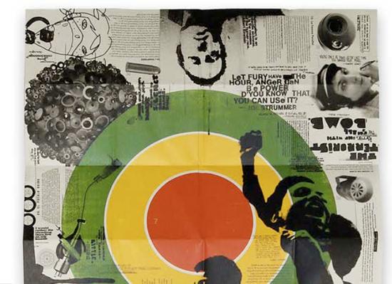
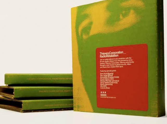
I'm always on the look out for some handsome and different looking ways of presenting album covers. Not so much in those 'special edition' packaging sets for die-hard fans, but just your general consumer release. Radio Retaliation really stood out to me when I first saw it on the shelves at Borders - and it taps into what I think may be the future of physical album packaging. The CD is packaged in a jewel case or digipak. It comes bound in a cardboard folder - real industrial stength cardboard box cardboard. Folded within this is a giant sized poster designed with a really nice 'cut and paste aesthetic on recycled stock, that contains all the lyrics and details. The CD is nestled within this, no foam nub to hold it or anything - outside of the actual CD it's all paper, no plastic whatsoever. Plus, it has a ninja on the cover and everybody loves ninjas.
The package aesthetic all relates perfectly to the (subtle) political messages that The Thievery Corporation are delivering on the album, a swirling world music mixture that leaves you mostly unaware of the social contexts upon a first casual listen. A plethora of world music greats guest on the album including daughter of sitar master Ravi Shankar, and sitar virtuoso in her own right Anoushka Shankar, as well as Nigerian afro-beat star Femi Kuti, respected Brazilian vocalist Seu Jorge, Slovakian singer and violinist Jana Andevska, and DC-based "Godfather of Go-Go" Chuck Brown. There's a reason for the prominence of these artists, mostly of 'Third World' heritage. The mission statement seems to be to deliver humanitarian and politcal messages through these global voices, emphasised beautifully by the packaging as a direct response to the often vapid irepetitive pop music so often delivered over the airwaves, Radio Retaliation indeed