Real World, Real Cover Changes

A couple of weeks ago I got myself out and about to a weekend of beautiful music and amazing atmosphere at Adelaide's now annual Womad Festival. Now I loves me some World Music, this from possibly the whitest guy in Adelaide! Anyway, as usual at the event, it's not long after being blown away by whatever throat singers or fife players are on this years bill, until I find myself at the onsite music retailer, flicking through the albums of the various performers. It was while perusing that I came across the latest release from Chinese performer Guo Yue, who was usually released through Real World Records, looking at the cover my immediate assumption was that this was no longer the case.

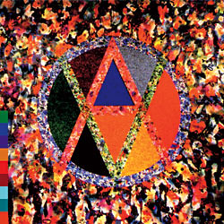
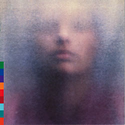
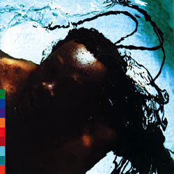
A little background information for the uninitiated. Real World Records was established by performert Peter Gabriel to provide talented artists from around the world with access to state-of-the-art recording facilities and to publicise them to an audience beyond their immediate geographic region. This was a fantastic idea, and a rare example of someone who was famous and wealthy actually using that fame and wealth to do something interesting and worthwhile. What drew me originally to Real World's albums was a singular and beautiful tratment to their cover designs. Whether the cover featured a stunning portrait of the perfomer or, more often, an abstract representation of the music, they all shared one feature. The covers featured neither artist and album title credit. This was a brilliant and subtle house style, what better way to emphasise that the music crosses geographic, cultural and language barriers than to feature no type on the front at all?

So the thing that surprised me about the latest Guo Yue release? It has the artist's name and album title (in English) on the front. When I went to the Real Word site, I discovered this wasn't a one off anomoly, all of their latest releases were the same. It's interesting to perhaps speculate on how this change in house style may have come about, though it's probably nothing more interesting than a demand from suppliers and artists themselves for better recognition on the packaging.

To me it feels like a great loss to the oft-times pretty boring music design landscape. The CD designs themselves are still ok, but they have now somehow lost that original allure and mystery to be discovered in the music beyond the cover. I've gathered a gallery of some of my favourite covers through the years here. You can check out their latest releases in their catalogue if you want to compare.
Labels: album covers, design, music, Peter Gabriel, Real World, Womad


0 Comments:
Post a Comment
Subscribe to Post Comments [Atom]
<< Home