Finally the last in my series of interviews that I did while overseas! I must admit that I didn’t know a lot about Rafael Esquer when I contacted him other than loving the work he had done for musician Bjork and some other beautiful pieces of his work that I had seen in design annuals. I was absolutely blown away by Rafael’s work and dedication to the craft of graphic design when I finally got the chance to meet him. It’s rare to come across an individual in design that demonstrates such passion for their work and actually has something interesting and important to say with it. Rafael as a person was incredibly down-to-earth and humble about his achievements when we talked and was very generous with his time even though he was very busy. I could have talked to Rafael all day (as it was my tape recorder ran out!) This interview took place over lunch in a great little sushi restaurant .It somehow felt right to be an Australian designer talking to a designer from Mexico, living in New York and eating in a Japanese reataurant!
Chris Bowden: How did you get started in design?
Rafael Esquer: I'm from a very small town, very rural. I was always interested in drawing. When I finished High School, I told my mother that I wanted to move to Mexico City and pursue a career in art. In Mexico City I actually enrolled in photography first, I did that for a year and when I saw the graphic design students, I thought it looked really interesting. It was not only image, but type, a combination of things. I immediately changed form photography to graphic design. I was at the college in Mexico City for a couple of years, but then I moved to Los Angeles to study English. I thought it would be temporary¬—I really intended to go back to Mexico City to complete my degree there—but in L.A. I started working for a magazine and became the Art Director. Then I won a scholarship to go to The Art Center College of Design in Pasadena. So I stayed. After I finished my degree at Art Center, I moved to New York for a job offer. I've been here almost eleven years now.
CB: I noticed on your bio that you also studied sculpture and painting, how has that influenced your work?
RE: It has made me aware of the place of 'dimension' in my work. I've done a little bit of work in film as well which brings another layer. I think my experience in magazine design, for example, has helped me to think in terms of 'telling a story' when I design, to work in a sequence. I think that happens a lot with a piece of sculpture as well. There as so many more ways to look at a three dimensional object rather than just a flat image. Now when I do animation work or things for television, those experiences in sculpture, in magazine design have really helped me to be able to define a piece, to be able to get the proper pacing with it. Painting I still do a lot of . I'm doing a project which may take me ten years or even longer. It's about painting with words, it's based on one of my biggest influences in what I do, literature. I read a lot, every day I have to read, so I'm doing paintings based on the writings of some of my favourite authors such as Marguerite Duras and Marguerite Yourcenar, which happen to be both Marguerites! I've collected a lot of things that I really like about their writing. It's become this obsessive job of making compositions from letters, I'm only on my third piece, each one takes months.
CB: Ultimately you will collect them in an exhibition or a book?
RE: I've given up trying to control the final outcome of such things. Stuff just happens, you go with the flow. The writing is really beautiful to me, they touch me in a way. To be able to express this in a different way and maybe touch other people in a way that they have touched me could be interesting.
CB: It's enough just to work on it.
RE: For myself, it's very important to have this relationship with what you do. If I'm creating a mural for instance, for me it's a just a matter of really loving the process, not only the fun parts but the difficult parts as well. If you embrace the struggles, put yourself into it, it is then reflected in the work.
CB: When you're doing so much client work, most designers do need another creative outlet, to produce something for themselves.
RE: I've been lucky that since I have opened my own design business, all the clients I have had, they have come to me because of the kind of work I have done in the past. They are really prepared to listen and respect what I have to offer them.
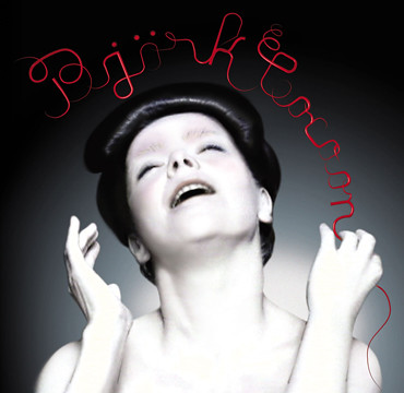
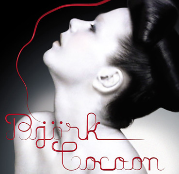
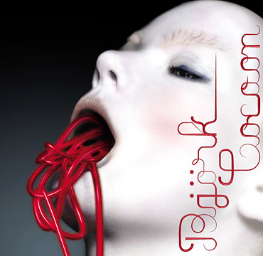
CB: I'm fascinated by the CD cover work you did for Bjork. I'm sure this would be a dream project for a lot of designers.
RE: It was great fun, really scary as well. I was working with Eiko Ishioka at the time, designing a collection for the Olympics at Salt Lake City. Eiko received an email from Bjork saying that she really liked her work and would she consider doing a music video. Apparently Bjork likes the same artist to work on everything, the videos, album covers, branding. Eiko told her that she was too busy to design the album cover, but suggested my name to her.Bjork trusted Eiko, so I met up with her and she said 'Ok, let's do it.' I had always been intrigued with Bjork visually, I had always thought she looked amazing, but I had never really paid much attention to her music. I've since become a big fan, when I listened to her music, I began to realise how brilliant and unique she was. She also happens to be avery nice person, very approachable, she wasn't a diva at all. What happened when I started the project was that I couldn't sleep for days! Looking at the legacy she has as an icon, I was worried about whether I would be able to contribute towards it. I showed her four ideas, she liked them all and ended up using them all. It was a great experience. I still sometimes get calls from people who want me to do their project in the style I did for Bjork. It's hard to say to them, well, you're not Bjork! This was done for her, it is what she wanted, she was very clear about what she wanted. I think the final product turned out very nice, I'm very proud of those images. I think they stand up next to what has been produced for her previously and since.
CB: Of all the projects you have worked on, which have given you the most personal satisfaction?
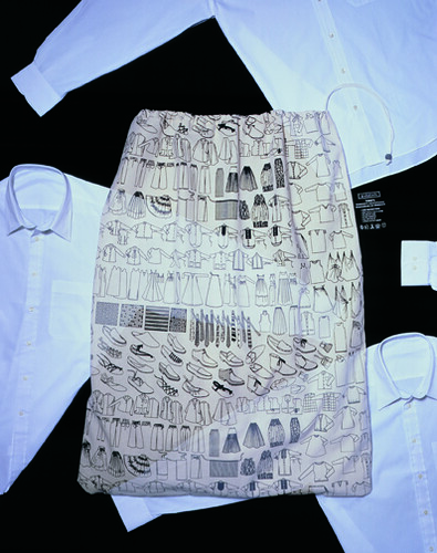
RE: I would say the laundry bags I did while working at @radical. The objective of the promotion was to spread warm wishes, remind various people about the company and most of all, remind everyone about the holiday season's true spirit. Instead of giving gifts, we asked clients to give clothing to those truly in need. The commitment included original design and manufacture of the bags, and continued with each of the company's offices coordinating pickup and delivery of donations to chosen charities. Just getting actual letters from some of the people who received the donated clothes, it makes you feel that graphic design can make a difference in somebody's life. It goes to show that self initiated projects can pay off, and it's given me the incentive to keep trying new things. The simple ideas are often the best, problems are everywhere. As graphic designers it's our role to solve problems for a client, for yourself, where ever there is a need.

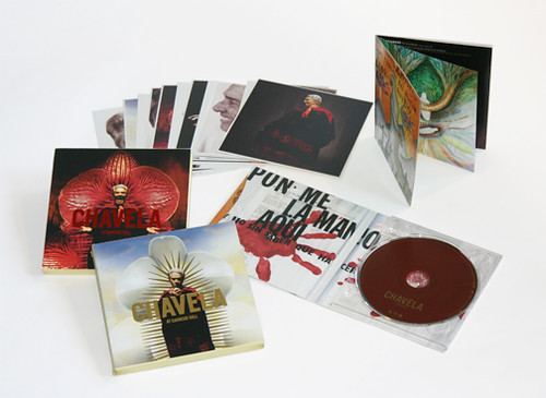
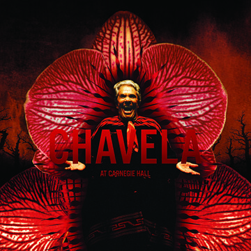
Another dream project was the CD box set for Chavela Vargas. Chavela is legendary for her rancheras. She’s one of my all-time favorite singer, and literally the Muse of Mexico. Growing up, I remember my mother singing at home to Chavela’s music. So the CD was recorded at her Carnegie Hall debut in 2003—at the age of 84! The show was sold out. To me, Chavela is an artist whose art doesn’t need explanation or translation. Just using her voice she communicates the whole spectrum of feelings: heartache, happiness, joy, misery, solitude, rage, flirtation, hope. It’d be wonderful if one can do the same with the language of graphic design. In my design for the CD packaging, I sought to capture the extremes that characterize Chavela’s life and music—sinner and saint. So I blended the orchid, as a symbol of female power and sexuality, with references to religion and Mexican legend. It was a beautiful project that blended design, image-making, typography, and illustration. I created original illustrations for the 20-page book included with the CD.
Looking back, I think my motivation for this project was to pay homage to my mother (a ranch woman herself) and to all the women, like Chavela, who despite anything never give up. Those strong women who, like a good wine, get better and wiser as time goes by.

CB: What project that you have yet to work on would you like to?
RE: I'd like to design a bottle for a very good vodka. It would be ideal to design everything for it, the packaging, the branding. I would love to bring some of my ideas in sculpture to the actual form of the bottle. It would be interesting to see the result of this interaction between sculpture and graphic design. A tequila bottle would also be interesting for me to design!
A project that I will start this year is not design per se, but related. I’d like to establish a design scholarship for minority students. I’m starting a line of t-shirts, graphically designed of course, to help this cause. This country is wonderful, if you work hard you can reach your dreams. I was able to receive a great education thanks to scholarships, so I intend to partner my alma mater, the Art Center College of Design, to help talented Latin students pay for their education. I believe we need more diversity in the design industry, and in small ways I’d like to contribute. Stay tuned….
Thanks once again to Rafael for his time and generosity (and for buying me lunch!) I'm sure you will be hearing about him and seeing a lot more of his work in the future. You can see more of Rafael's work
here at his website.