Favourite band name of the moment would have to be the UK's 'Shitdisco', coincidently, my favourite film clip at the moment is for their song 'OK', a wonderful 'lo-fi' combination of paper pop up artistry and puppetry directed by Price James. Dig it.
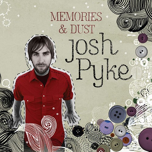
It seems to happen a lot in my life that I'll be trundling along, designing away. I'll look at a CD cover that I've down and say to myself, 'yeah, that's not too bad Chris, give yourself a pat on the back for that one tiger'. So, reasonably happy with what I'm producing. Then something will come along and completely blow my idea of competency in this area out of the water. This is what has happened to me upon viewing the latest cover for Josh Pyke's album Memories and Dust.
What can I say? It's a beautifu piecel, and the cover doesn't even encapsulate half of it. It's only when you unfold the sleeve and view the meticulous hand drawn lyrics on the inside do you really appreciate the artistry that's gone into it's production. I could weep at the care and attention that's gone into producing this.
So how does the album measure up to such an accomplished package? Well, lets just say to begin with, that Josh Pyke had been served exceedingly well with this presentation of his debut album.
What can I say about Josh Pyke's music? As an earnest young man with an acoustic guitar, he's never going to be lacking for competition in the market. My exposure to him initially was through the excellent first single 'Middle of the Hill', nothing else on the album really comes close to the urgency and undercurrent of personal melancholy portrayed in this song, which is a shame - I was expecting more quirk, like the cover - while the rest of the album's songs seem to follow a more breezy 'Jack Johnson vibe - good for those who likes that sort of stuff, and it certainly has an audience.
The cover art was created by James Hancock, and he's only 29 as well (talented and much younger than me, usually a potent mix to raise my ire or my levels of depression. He obviously enjoys the music, his enthusiasm for it is evident, and he's listened and searched out well among the lyrics to find appropriate graphic meataphors. There's a recurring theme of 'sewing and 'mending'' that plays out through the album, hence the motif of buttons and 'twiney' lines on the album art. It's also confessional, as most solo artist albums are, so the use of hand drawn 'folk type' is appropriate. Printed on uncoated stock in subdued greys and browns, it's hand made enough to portray an independent artist, but professionally enough produced to signify what I'm sure the label hopes will become a major artist. It really stands out on the racks next to your latest Beyonce release.
First albums are hard - especially when you receive a lot of expectation from an initial successful song. The artist wants to establish a unique identity. You can tell James Hancock the artist has put a lot of himself into this work, and by the album's top ten success, received a lot of exposure for it - it may be an unfortunate ramification that this style of his is now going to be indelibly associated with Josh Pyke.
You can view some more of James Hancock's great work at his website, including some more music design work for artist Darren Hanlon. Below I have included the great film clip for 'Middle of The Hill' featuring his artwork, it has hand claps in it as well! (Hand claps are the 'new black')
A collection of 'the greatest album covers from the 70s' as selected by a panel of distinguished art directors, designers, photographers and editors in a 1991 issue of Rolling Stone magazine. Not too many arguments over the selection.
I love me some Mambo gear, one of the few companies that have been able over the years to portray an Australian perspective in art and design. They have a new site up, and as is to be expected, it's great.
Why design goes wrong, find out here why it all so often goes pear shaped.
And on a similar note, the top ten things they didn't teach you in design school here. I could probably add a few things.
The Adelaide Art Directors had their awards ceremony the other night, as usual, some nice work from design firms Parallax and Black Squid weren't enough to perk up a pretty lacklustre collection, especially from the advertsing side. Judge for yourself and download the 'winners' catalogue.
An Australian icon, the Sydney Opera house has had a rebrand courtesy of that clever English chappy Vince Frost.
Clever cat catches the bus daily to the local fish and chip shop. Your cat wants Whiting with minimum chips.
I work as a Graphic Designer in Adelaide South Australia. In my spare time I design CD covers for local music releases and ponder the meaning of it all. I like to read the daily obituaries and then cross the names out of the phone book. I feel uncomfortable around mobile phones, babies and deep pile carpeting.