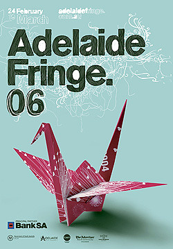
Adelaide Fringe 2006 Poster

The Adelaide Fringe began in 1960 as an alternative to the Adelaide Festival of Arts, an 'open access event' that allows anyone with ideas, enthusiasm (and admittedly, the registration fees!) to be part of the program. It has grown over the years to become perhaps the second biggest arts festival of it's kind, only eclipsed by the Edinburgh Fringe.
In the spirit of an 'open access event' the promotional poster is chosen each year by a contest that is open to the public, a method that you can probably imagine has produced mixed results over the years. It's probably the most 'well entered' contest of it's kind in Adelaide, a favourite among students and professional designers alike that have dominated the submissions in recent years (it seems every third or fourth Fringe that they try to regain their open access policy by awarding the winning entry to someone who isn't studying or employed as a designer:)
The past few years, the Fringe has also been big on giving the event a specific 'theme' to help direct the would-be designers in their interpretation (I guess this theme encompasses the Fringe as a whole as well).The theme for 2006 is 'Re-generation' and the idea of re-inventing itself. Winner of this years poster contest was Roger Tiley, a designer at uber-great local design firm Do-Da. He chose to interpret the theme of re-generation by recycling previous years posters into origami cranes.
As far as conveying said theme - it's not bad as concepts go - it of course depends largely on the viewer being familiar with past posters to get it's point across, easy if you have a mind for remembering past designs, but as designers we often forget that a poster such as this is an immediate thing and probably forgotten by the general public a week after the event finishes. Anyway, ok as a concept, but if you're really going to dip into the history of an event approaching it's 50th anniversary - re-inventing itself - it would suggest to me that you might want to dip a bit further into that history and use some posters that cover a greater timeline than the last 8 years. Does the Fringe really need to re-invent itself from the last 8 years? To be fair, I would hazard a guess that it has more to do with the availability of past posters to fold, than deliberately snubbing earlier posters.
The Adelaide Fringe Website goes into great lengths in justifying the use of the paper crane on the poster. You can read it here,
they seem to be drawing a pretty long bow in my opinion, tying it into Hiroshima victims, Japanese legends and the perfect symbol of peace - pretty heady stuff! My first reaction when I saw the poster was, 'Well if you're going to use origami, a crane is the obvious piece of folding to use so people know that it is origami. The explanation smacks a little bit of the 'bullshit' that we designers use to justify our amazing design creations to a client. You know how it goes - you design it, you love it, you need to find a way to re-assure the client that their trust and money spent is warranted. My apologies to Roger if the design did stem from his deep thoughts into the matter, it sounds pretty heavy going for an event that has previously been represented by a pink reindeer and a close up of someone's tonsils.
As nicely folded as the paper crane is, it's not the most dynamic visual you can imagine, it's a little sedate, which is ok, but to me the Fringe is all about life and movement - it's a two week blast of comedy, music & theatre, a chance to try new things and to laugh and take in the vibe surrounding you. The poster needs to draw you into the event - a paper crane just isn't doing that for me.
The finished poster was done in conjunction with designers for this years Fringe 'Nicknack'. An organic, handrawn headline works well against the precisely folded crane to the extent that it's actually a lot more exciting than it. With some more work I feel that the type treatment could have been the basis for the whole poster and still have fitted in with the Fringe's much touted re-generation theme. I like the teal background as well - you can never have enough teal - I think I might paint my bedroom in it! :)
All that said, the poster is out there, tickets are selling, the Fringe people are happy with it, Roger Tiley is going to Malaysia (or where ever his prize was to!) and I'm not - maybe I should enter next time and put my money where my mouth is!
A quick note to the Fringe regarding the poster's size. Normally the poster is printed up A1-A0 sizes, the largest I've seen is A2 and mostly I've seen it at a puny A4. It looks like a flyer for a Primary School fete at this size. I know they had the extra costs of printing four different posters (in full colour no-less) but the Fringe poster needs to be seen around town AS BIG AS POSSIBLE! Especially with the delicate nature of this years imagery.


0 Comments:
Post a Comment
Subscribe to Post Comments [Atom]
<< Home