Revenge of the Graduate Portfolio 2
Photography formed a large part of the curriculum in my fourth year design studies. Where a lot of my compatriots in the course were keen photographers and really into the whole process of setting up studio lighting and breaking out the large format camera, I was never that confident in my photography skills. A lot of the technical requirement's of taking proper light meter readings and developing the film seemed time consuming and boring - just thinking about it seemed to sap a lot of the enthusiasm I might have had for the project right out of it. My initial thoughts always seemed to turn to how can I knock this off as easily and quickly as possible - but still tackle it in an innovative and (personally) creative way, specifically in a manner that no one else was approaching it.
The lecturers were big on combining disciplines that year, less work for them I guess, so it came as no surprise to anyone when we were assigned a photography/typography project, specifically to design a calendar.
As far as the 'brief' for it went, it was your typical university course 'open ended' brief, we were allowed to do what ever we wanted with it as long as it encapsulated photography and typography. If there was a 'client' in mind, I guess it would be the designer's dream project of a calendar for a paper merchant or printer. One stipulation may have been that each photo should reflect the month it was portraying in some way, I can't remember, it may have been a matter of of that being imposed by myself to try and direct what my interpretation might be.
Keeping in mind that this was back pre my computer usage - as soon as we got the assignment my first thoughts were how I was going to lay the date information onto the photos. I didn't have access to a scanner, the only way to get type onto a photo would be through the use of letraset - hours of meticulously having to lay down each number for the calendar wasn't an encouraging thought. I was also dreading the planning that would need to go into shooting the photo so as to leave enough room to place the type. I was getting less and less enthusiastic.
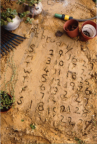
I don't know when the solution struck me, maybe I was lazily scribbling in the dirt with a stick (it has a Newton 'Eureka!' vibe to it) It's probably fair to say that seeing as I was a student, whatever I was doing at the time was probably 'lazily'. It occurred to me that I could incorporate the type for the calendar already in the photograph - I take the shot and I'm done in one. All at once the possibilities of where I could go with this seemed endless.
The picture above for 'February' was one of the first shots I took - a simple matter of writing the calendar in the mud in my backyard, surrounded by some of my mother's pots (love those teapot planters :) Where possible I tried to stick to a 'theme' for the month, for example, in January I wrote the calendar in zinc cream on my father's back, in June I wrote it in the frost on my bedroom window. I wanted to keep the photos spontaneous, so the shot was set up using available light conditions.
I think they all turned out reasonably well, it was certainly worlds away from what anyone else did and for once I think I receive a good mark for a photography assignment.
posted by Chris Bowden at
12:44 PM
![]()
![]()


0 Comments:
Post a Comment
Subscribe to Post Comments [Atom]
<< Home