Tuesday, February 28, 2006

Judging albums by their cover 4


Fonda 500: The Autumn: Winter collection

Fonda 500's 'The Autumn: Winter Collection' was really the inspiration for my 'Judging albums by their cover' articles. It has been a habit of mine for some time to discover new music by picking out albums that had covers that I liked, almost 90% of the time it turned out that I loved the music on the album as well. The Autumn: Winter Collection was discovered during one of my frequent rummages through the secondhand stacks at Bigstar Records. I have to admit, I'm a big fan of the 'looks like a five year old drew the cover' aesthetic - a style which is harder to pull off than you would probably imagine. I think I may have had in the back of my mind that this album was something that I had read a review for a couple of months earlier - originally thought the band's name was 'Autumn' and the album was called 'Winter Collection. It was only months later that I discovered 'Fonda 500 tucked on the CD edge (what I had originally thought was the record label's name!) I was really drawn to the simplicity of the graphics, basic black and white, handwritten text, naive imagery - it felt Autumn/Winterish, like a memory back to childhood when the seasons seemed all the more defined and more simply separated.

So how does the music relate to the cover graphics? The way I would describe the music is if a 1970's primary school teacher, taking her classes music lesson, decides to lock her charges in the music room and tells them they have an hour to produce 12 compositions on the theme of Autumn & Winter with the instruments provided - and I mean that in a good way!

This probably falls under the genre of 'Bedroom Pop' usually a pejorative, Fonda 500 carry it off with a mischievous imagination. Beach Boy like harmonies, cartoon imagery, weird instruments, out-of-tune guitars, nursery rhyme like lyrics, songs about snowball fights, eating biscuits and duffel coats. The Autumn: Winter Collection validates the fact that minimal budget is no barrier to creating intriguing , lovable, melodic, confusing and frankly wonderful pop music - likewise when it comes to cover graphics.

Wednesday, February 22, 2006

Recent Surfing Highlights 4

Do you really need a professional designer to design your logo? Maybe this article will convince you.

Interesting British design blog 30gms. Love the article on Peter Saville's CMYK garden.

The Audreys fab new album 'Between Last Night And Us' gets reviewed by The Age newspaper here. Expect my own review here soon under Judging Albums By Their Cover.

A very large kitty. File under 'Your cat wants to win The Biggest Loser.'

Tuesday, February 21, 2006

Big Bank Dabbles In Irony


Maybe I'm looking into this too much, but I can't help but be bemused by The National Australia Bank's decision to abbreviate to 'nab'. The bank has seen it's share of troubles over the last few years, too boring to go into here, the name change seems ironically appropriate. My dictionary defines 'nab' as to snatch or seize suddenly or without knowledge. I don't know if I'd have a lot of confidence putting my money into an institution so named. Perhaps it's meant to be social commentary on those sudden bank fees that seem to hit my account if I go anywhere near an ATM machine? Or the sudden massive layoffs of bank employees that are becoming an all too common occurrence? If that's the case I've got to praise them on their honesty at least.

The logo with it's all lowercase letters is an odd looking mark as well, inelegant to look at and to say - 'nab'? Roll that over your tongue a few times, this is an improvement over 'The National'? At least that carried some authority. I'm sure a lot of money was thrown at it to come up with this, so obviously I'm crazy and the nab's coffers will overflow with the milk and honey of the re-branding success. Now I'm going to go 'nab' me some lunch.

Designers Who Are Better Than Me 3

Adelaide design firm Nicknack have just updated and relaunched their website with a clean, no-nonsense interface. They are designers for the 2006 Adelaide Fringe, their portfolio demonstrating some great treatments for various applications of the identity to programs, flyers, apparel and the like. They also do work for Nike (the lucky buggers!) nice to see an Adelaide firm working on such a design conscious brand. I really like the work they've done for the 'Brasil' campaign, looks like it would have been a lot of fun to work on. Overall, a nice mixture of the corporate and the funky, take some time to be inspired.

Monday, February 20, 2006

Judging albums by their cover 3


Architecture In Helsinki: In Case We Die

Design & Music would seem to be a perfect match. Art and design school seem to be filled with would-be-musicians, and many a well known band has found it's genesis in one of these institutions over the years. It comes as some what of a mystery then, why there remains so many really badly designed album covers. A lot of output from the major labels can be put down to the machinations of their marketing departments. Primarily they are releasing albums to move product, therefore they are trying to create an 'image' of the artist, an 'ideal' that their intended market (whether this be teenage girls are whatever) want to aspire to, rather than an interpretation of the specifics of the music (in a lot of cases there wouldn't be that much to work from anyway). The independent release has a lot more freedom and hence, the results of the cover artwork should be better, unfortunately there are still a lot of roadblocks in the way to stymie this. Bands just starting out and releasing their first album are often still finding their feet as far as style and image. They are invariably short of cash and any money they do have is usually put into producing the best recording they can, using a designer for cover artwork is probably last on their list of priorities. This leaves the design of the cover up to the most 'capable' band member or a friend who has some artistic ability (or at least knows how to use Publisher! :)

The fall-back and easiest position is to usually copy the aesthetic style of their musical idols and inspiration (as best they can) rather than establishing their own visual identity. This can work ok as long as all the members agree on this aesthetic - the worse case scenario is the 'design by committee'. This happens when everyone from friends, family, partners, their hairdresser (she's really artistic!) put their two cents in over the design. What results is a cover that tries to incorporate everything and please everyone, but ultimately portrays nothing other than a confusing, unappealing morass.

Sometimes bands get lucky though, and actually have a member with design talent and an individual vision - such is the case with Architecture In Helsinki's 'In Case We Die'. The advantages of being an independent band with their own label are self -evident on the cover. It's doubtful that a major label would find the artwork of front-man Cameron Bird particularly marketable, even though it perfectly parallels the bands style - a handmade aesthetic. It combines childlike scribbles and free-hand fonts with a clear, colourful, hand-drawn style. The band photos on the inside cover are playfully coloured, scribbled upon and drawn around in a spontaneous, random manner, much like the band introduces unusual instrumentation and lyric structure to the songs. Architecture In Helsinki quite literally wear their independence on their sleeve.

Thursday, February 16, 2006

Adelaide Fringe 2006 Poster


The Adelaide Fringe began in 1960 as an alternative to the Adelaide Festival of Arts, an 'open access event' that allows anyone with ideas, enthusiasm (and admittedly, the registration fees!) to be part of the program. It has grown over the years to become perhaps the second biggest arts festival of it's kind, only eclipsed by the Edinburgh Fringe.

In the spirit of an 'open access event' the promotional poster is chosen each year by a contest that is open to the public, a method that you can probably imagine has produced mixed results over the years. It's probably the most 'well entered' contest of it's kind in Adelaide, a favourite among students and professional designers alike that have dominated the submissions in recent years (it seems every third or fourth Fringe that they try to regain their open access policy by awarding the winning entry to someone who isn't studying or employed as a designer:)

The past few years, the Fringe has also been big on giving the event a specific 'theme' to help direct the would-be designers in their interpretation (I guess this theme encompasses the Fringe as a whole as well).The theme for 2006 is 'Re-generation' and the idea of re-inventing itself. Winner of this years poster contest was Roger Tiley, a designer at uber-great local design firm Do-Da. He chose to interpret the theme of re-generation by recycling previous years posters into origami cranes.

As far as conveying said theme - it's not bad as concepts go - it of course depends largely on the viewer being familiar with past posters to get it's point across, easy if you have a mind for remembering past designs, but as designers we often forget that a poster such as this is an immediate thing and probably forgotten by the general public a week after the event finishes. Anyway, ok as a concept, but if you're really going to dip into the history of an event approaching it's 50th anniversary - re-inventing itself - it would suggest to me that you might want to dip a bit further into that history and use some posters that cover a greater timeline than the last 8 years. Does the Fringe really need to re-invent itself from the last 8 years? To be fair, I would hazard a guess that it has more to do with the availability of past posters to fold, than deliberately snubbing earlier posters.

The Adelaide Fringe Website goes into great lengths in justifying the use of the paper crane on the poster. You can read it here,
they seem to be drawing a pretty long bow in my opinion, tying it into Hiroshima victims, Japanese legends and the perfect symbol of peace - pretty heady stuff! My first reaction when I saw the poster was, 'Well if you're going to use origami, a crane is the obvious piece of folding to use so people know that it is origami. The explanation smacks a little bit of the 'bullshit' that we designers use to justify our amazing design creations to a client. You know how it goes - you design it, you love it, you need to find a way to re-assure the client that their trust and money spent is warranted. My apologies to Roger if the design did stem from his deep thoughts into the matter, it sounds pretty heavy going for an event that has previously been represented by a pink reindeer and a close up of someone's tonsils.

As nicely folded as the paper crane is, it's not the most dynamic visual you can imagine, it's a little sedate, which is ok, but to me the Fringe is all about life and movement - it's a two week blast of comedy, music & theatre, a chance to try new things and to laugh and take in the vibe surrounding you. The poster needs to draw you into the event - a paper crane just isn't doing that for me.

The finished poster was done in conjunction with designers for this years Fringe 'Nicknack'. An organic, handrawn headline works well against the precisely folded crane to the extent that it's actually a lot more exciting than it. With some more work I feel that the type treatment could have been the basis for the whole poster and still have fitted in with the Fringe's much touted re-generation theme. I like the teal background as well - you can never have enough teal - I think I might paint my bedroom in it! :)

All that said, the poster is out there, tickets are selling, the Fringe people are happy with it, Roger Tiley is going to Malaysia (or where ever his prize was to!) and I'm not - maybe I should enter next time and put my money where my mouth is!

A quick note to the Fringe regarding the poster's size. Normally the poster is printed up A1-A0 sizes, the largest I've seen is A2 and mostly I've seen it at a puny A4. It looks like a flyer for a Primary School fete at this size. I know they had the extra costs of printing four different posters (in full colour no-less) but the Fringe poster needs to be seen around town AS BIG AS POSSIBLE! Especially with the delicate nature of this years imagery.

Tuesday, February 14, 2006

Recent Surfing Highlights 3

The Hall of Knowledge is a fantastic hand lettered, entirely typographic comic strip.

Polish designers seem to be given a lot of leeway when it comes to producing posters for Hollywood films, take a look at these amazing, weird and wonderful takes on some well known movies in this gallery courtesy of Retrocrush.

Fantastic music clip of the week by Paris collective Pleix. File under 'your dog craves techno'.

The Knockoff Project displays album covers that spoof, honour or simply rip-off other album covers.

I'm now officially a 'designer who blogs.'

Monday, February 13, 2006

Judging albums by their cover 2


Jose Gonzalez: Veneer

Veneer is the debut album by Swedish singer/songwriter Jose Gonzalez, like Nick Drake before him, it is seemingly impossible to listen to his music 'loud'. Veneer's sparse soundscape is a showcase of Gonzalez's hushed, double tracked vocals, haunting imagery rich lyrics and acoustic guitar virtuosity.

Just as the music is stripped back to the bare essentials of voice, guitar and occasional percussion, the cd package aesthetics are similarly kept to a minimum, giving you a good idea of what to expect when you listen to the album. A single colour on a beige uncoated paper stock throughout, is punctuated within by ethereal, whimsical illustrations, the cover in particular brings to mind an almost 'folk art' interpretation of the topographic like line work on the cover of Joy Division's 'Unknown Pleasures' album. I particularly like the bizarre horse/accordion?/fetus illustration on the inside of the CD tray, tucked behind a solid black disk, almost as an after thought, an endearing discovery when you lift the cd out.

This is great music to work/create to, or simply drift off to sleep at night to. It's difficult to craft an album of just voice and guitar and keep it fresh and interesting, as it is to craft a cd package with similar restrictions. An involving combination of soft music and soft design.

Thursday, February 09, 2006

Designers Who Are better Than Me 2

It's with much sadness that I bid farewell to Sarah Cain from the employ of Martins. Since I started at Martins just over two years ago, she has been a reassuring and friendly work colleague, especially helpful during my early days there and my adjustment from a 4 person small design firm to the large environs at Martins. She's an excellent designer to boot as well, taking and tackling every project with professionalism and aplomb, it's no surprise when the time comes around to work out which pieces will be sent off to various design awards, her work is prominent in the selection. I'll miss being able to pop my head over the partition to chat to her, her laughing at all my jokes (I appreciate the attempt, 95% usually aren't that funny) and I'll sure as hell miss having someone around who is at least within the ballpark of my age. Sarah is moving on to work with the fine folk at Slippery Fish, I look forward in the coming months to seeing some of the design pieces she produces at her new workplace. So my best wishes go with Sarah - as long as she remains happy with her design, that's the main thing!

Adelaide Festival of Arts 2006 Poster


The 2006 Adelaide Festival of Arts, one of Australia's pre-eminent art festivals begins in early March, the poster for it has been up and around for a couple of months now, so I thought I'd take the time to review it in the context of the forthcoming event.

A bit of history for the uninitiated on the festival. It was established in the 1960s as the first major arts festival in Australia, in recent years it's seen its 'pre-eminence' dampened somewhat by arts festivals in Sydney and Melbourne, some lackluster programmes, poor artistic director choices, and lack of funding. The 2006 event finds itself back on it's feet a bit more, finally out of debt and with increased sponsorship, 2006 Artistic Director Brett Sheehy has promised 'a more exciting and quality filled programme', but then he would wouldn't he.

The thing that has impressed me about past Festival posters is how important a part they have played in establishing the very character of the event. The unveiling of the design is one of the few graphic design stories that is deemed 'news-worthy' in Adelaide, and usually the design will stir some controversial reaction, whether it be the religious backlash over 1998's poster featuring The Madonna playing an accordion or 1988's with it's not so subtle pencil/penis graphic. The important thing to me is at least people are taking notice - a poster advertising an Arts Festival should be confronting, it should be quirky and even difficult to understand, in effect it should convey the personality of the programme, without excluding a warmth that encompasses the populace it is aimed at. It shouldn't crawl up it's own backside so much with it's cleverness. The two posters from 1988 and 1998 I feel were very successful in establishing both what the personality of their respective festivals would be, and an insight into what would be on the programme.

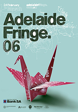
Which brings me to this years poster. Designed by local firms Detour and Parallax, headed by Matthew and Abra Remphrey and Cathy Packer, it's great that the festival decided to go with a couple of the many great young design firms in the city. Both Detour and Parallax have been racking up awards nationally & internationally for their design efforts, they're good designers, passionate about what they do, I should know, I studied with them!:)

Festival Artistic Director Sheehy describes his festival as 'a merger between technology and art, minimalist, futuristic and reflective of the giga-faceted world in which we live' I'll have to take his word on that! He describes the poster as 'a decorative mirror image, sized to fit a fridge door(!?) positioning Adelaide as the backdrop to this steadily reviving arts event, bold high tech lines with letters built from Adelaide's streetscape, what you see at first is a mirror, a pure reflection of yourself looking into it, a reflection of humanity and the world around us, as all festivals should be, simple and clean.'

Technically it's brilliant, a designer's wet dream to both execute and examine. Building the letters out of an overlay of Adelaide's streetscape is a clever idea. Adelaide in one of the few cities in the world, pre 20th century to be planned out, the grid of it's streets and parks are a pervading influence on the everyday life of the people who live and commute to the city centre, so kudos for incorporating a feature so linked to the very heart and history of Adelaide itself. The only problem is that maybe it falls into that category of being to clever for it's own good, the only way I new it was an overlay of the streetscape was when I was told it was such, I just thought it was an interesting circuit board type effect, perhaps some inclination that this festival would be embracing insights into new technology (which is the case). It's effect seems somewhat diminished when you need to be told, suddenly it doesn't feel all that inclusive, it feels like you're not smart enough to get it.

As an identity the letterforms carry over well (as would be expected from designers well versed in corporate identity) onto many varied applications from press ads, to stationery items to apparel, a feat that distinguishes it from many festival identities past.

The other major feature of the poster is the reflective, mirror like stock it is printed on, it's intention to mirror the viewer, to include them as part of the poster and hence the festival itself. It's a nice idea, done many times before. It reminds me of a poster for a play from the Adleaide Fringe of the early 90s, a psychological pastiche of old B-grade horror movies titled along the lines of 'The Eyes of Dr Mabuse' (or something like that). The poster was printed on reflective silver stock, with a pair of staring, intense eyes as it's main graphic. The 'fun-house mirror distortion' effect worked well for that plays subject matter, an hallucinary journey into the psyche. I'm not sure it's as effective in the 2006 Festival update - looking into it, is it saying the festival will lack focus? It's programme will distort the views that you currently hold? (I mean that in a good way!), or that by looking into it's reflective surface, that I need to lay off the cherry ripes and twisties. The choice of stock for the posters doesn't help much either, I've noticed that the posters have begun to distort and look kind of ragged in many a shop window over the past months due to being printed on what feels and looks like festive wrapping paper (hmmm, maybe this is intentional come to think of it?) The design fares better on one of the promotional postcards I picked up, I hope that they've printed some of the posters on that kind of thicker stock.

I can look at the poster as a designer and say it's a great technical piece of graphic design. My regret with it is that unfortunately it feels a little cold and detatched, it's technically too brilliant, too clever, there's no quirk that moves me beyond the coolness of it's execution. It instills in me the impression that this festival is to be very serious, very calculated, 'leave it to us, we know what is good for you', the poster states 'Your Festival' but somehow I don't feel that included.

I think the designers have done a good job following the Festivals brief (as outlined by Sheehy above) and in creating a strong corporate identity for the event. Perhaps that's where my position falls down. I look upon the Arts Festival as a chance for me to broaden my horizons, to be shocked, surprised, enlightened, to view and experience things I wouldn't have contemplated. The thing is, the Adelaide Festival has grown to the point it is expected to 'pay it's own way' it's a corporate event as much as an artistic event - probably even more-so. It's been through tough times where it took chances that weren't successful, it needs to reassure rather than shock to guarantee it's continued existence, to play safe in a lot of ways to continue it's sponsorship.
I'm looking at the poster in too much in an artistic sense, rather than as an effective business tool

From all reports tickets sales for the festival so far have been impressive - so perhaps a strong cool corporate identity is working for them. For me though, it feels like a bit of a missed opportunity for graphic design to really lead the way - roll on Festival 2008.

Monday, February 06, 2006

Recent Surfing Highlights

File under 'now I've seen everything.' The ultimate designer accessory, black toilet paper.

Typographica lists their best fonts of 2005.

Beautiful old circus logos.

Mascots unveiled for the Winter Olympics.

Past posters for the Adelaide Festival of Arts.

Friday, February 03, 2006

Judging albums by their cover


Wilco: A Ghost is Born

I was first brought to the attention of Wilco by their collaboration with Billy Bragg on the Woody Guthrie tribute/interpretation album 'Mermaid Avenue'. I bought their album Yankee Hotel Foxtrot on the strength of that, it was quite a departure - the first demonstration that Wilco's music would be a difficult and involving journey.

Wilco make albums, not collections of individual songs. The music requires patience to get into and an album needs to be listened to right through to be fully appreciated. The album 'A Ghost is Born' demonstrates once again that persistence rewards the listener of their music. 'Yankee Hotel Foxtrot' has an interesting history. Deemed unreleasable by their label, Wilco bought the album off of them, and sold it to a smaller label (ironically, a subsidiary of that larger one, in effect they bought it twice). Wilco's instincts were correct, it was a hit for them, the notoriety allowing them to release an even more uncompromising album in 'A Ghost is Born'. Songs vary in length from a couple of minutes to over 15 minutes, it hardly matters though, the songs drift into one another, so by the end it feels complete.

This aesthetic carries over into the CD design itself. Never before have I come across a cd package that was so integral to the experience of the album. The first layer on the case is a plastic wrapper that has the title 'Wilco A Ghost is Born'. peel off the wrapper and you are left with an image of a white egg on a white background, beautifully captured in all of it's minimalist intensity. On the backside of the CD, the egg develops a crack. Pull out the sleeve, the egg has hatched and you see the two halves. The Disk itself has a yellow ring at the centre (the yolk), the disk lies on a picture of a bed of straw on the inside of the case itself. The effect is 'the ghost is born', and gains life when the CD is played.

A beautiful, intelligent and engaging piece of design and a real listening experience.

Thursday, February 02, 2006

Designers Who Are Better Than Me

A look through the web-o-sphere at some local and not so local designers who have inspired me, made me think, made me jealous, made me mad or are just infuriatingly better than me.

First off the block is local Adelaide firm Black Squid. Established by Director Derek Butler, they've been producing some excellent work for quite a few years now. Derek is obviously pretty passionate about design, he's served a few terms on the local Australian Graphic Design Association local committee, producing some nice event calendars and promotional materials as well. The quality of Black Squid's design output has been complimented in recent years with the inclusion of designer/illustrator/artist Melanie Terrett to the team. Melanie studied a year behind me at high school and university, though I've only spoken to her on a couple of occasions, I tried to get my old employers to hire her at one point, but it wasn't to be, their loss is Black Squid's gain I guess. She brings a beautiful illustrative aesthetic to whatever she designs, as seen in Black Squid's website folio. I think Derek's own modern clean style is a nice counterpoint. I particularly like the whimsy of the identity they worked on for TV program 'My Restaurant Rules' winners 'The Greedy Goose. The restaurant interior is also decorated with some of Melanie's paintings.

Black Squid's website is nothing splashy, it Abley demonstrates their capabilities in a professional, easygoing manner and is written in a fun style. They all seem like they're nice enough people, working in a fun and invigorating environment. Check out the site for some graphic goodness (make sure you look in the 'experimental' section as well).

Recent Surfing Highlights

Icelandic band Sigur Ros always have excellent film clips. The latest for their song Glosoli is an incredibly beautiful and moving experience. It is taken from their latest album 'Takk' (the video is included as a feature on the album.)

Website for local roots band The Audreys. I've enjoyed a number of their live gigs (not to mention their impeccable dress sense) and last years ep release 'You and Steve Mcqueen' was a local treat. I'm looking forward to the upcoming long-player 'Between Last Night and Us', out in February 2006.

Unfortunate advertisement placement

Newly commissioned covers for some classic books from Penguin, all done by some of the top names in independent comic books.

The perennial battle of creatives, pets vs workspace.