Wednesday, June 28, 2006

Furry Fuhrers


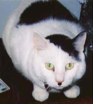
Cats seem like and endless source of inspiration on the web. Site makers seem fascinated by our furry companions, joining popular sites like Bonsai Kitten & Stuff on my Cat is Hitler Cats. You read that right, as the moggie above us demonstrates, this is a site dedicated to cats that resemble Hitler. Okay, maybe it's not exactly politically correct, but it's called a sense of humour and one of the funniest things I've come across in quite a while. This must be what the web was created for! I'm sure all of us have had experiences with cats where that gleam in their eye seemed to indicate something more 'what's for dinner tonight?' The picture of that cat above freaks me out the more I look at it, the resemblance is uncanny....

I've had my own experience with a Furry Fuhrer. A previous girlfriend had a cat called Max who looked pretty close to the cat above, we were convinced he was the reincarnation of the maniacal dictator himself. He was a cat with some deep psychological problems and some anger issues to work out. One minute he would be lying pleasantly on your lap purring, the next he would be going for your throat unprovoked, claws and fangs bared. It wasn't uncommon for me to hear a shriek from another part of the house, only to run out and find my girlfriend bailed up in a corner, water pistol in one hand, cushion in another fending Max off. I don't know what became of Max, I wouldn't be surprised if he's plotting to invade Poland at this moment though.

So what does this have to do with design? Well... ummm... doesn't nature work in some mysterious ways!

Friday, June 23, 2006

Designers Who Are Better Than Me 9

Parallax Design wants you to know that they sell imagination, (personally I prefer to only lend mine out on weekdays and make sure it's back by six) it's a good thing they have plenty on offer because at these prices you'd be crazy to shop for your imagination anywhere else. Parallax is run by 'pal 'o mine' from my Uni days Matthew Remphrey and after a few years in business he's finally put up an honest to gosh website for us to all ooh and ahh over (and you will!)

I've probably talked about Matthew's work on this blog more than anyone's, particularly his work on the recent Adelaide Festival of Arts, hopefully he doesn't want to punch me in the face next time I run into him, but Parallax are producing some very recognisable and awarded work at the moment, right from the heart of little old Adelaide.

A little history on Matthew from my perspective, he went through the Illustration stream at the University of South Australia's Bachelor of Design course at the same time I did Visual Communication (proof that in the final analysis, it probably didn't matter which stream you chose to follow). After graduating he formed a design/marketing company called Punch! with fellow graduate Andrew Rice which lasted for a couple of years. Andrew decided to move interstate and Matthew moved onto IK Design where he quickly began to produce some impressive design work that earned him many national and international design awards as well as being featured in all the big graphic design publications such as Graphis and Communication Arts. An overseas trip to the US contributed to the inspiration to go out on his own and form Parallax.

I think you can still see some of the influence of those IK Design years, especially in the SA Tourism 'Brilliant Blend' mark, but if you look at the identity work he did on Mexican Burritto outlet "Burp' there's a definite growth away from anything I could imagine IK Design producing. This identity is a perfect example of the 'simpatico' that parallax seems to manage with their clients, not only is it extremely appropriate and well produced, it's also a lot of fun and light years away from your typical fast-food outlet identity, this is a piece that respects the intelligence of both the client and their customers.

In a recent article on Parallax, Matthew held that the idea is central to the core of what Parallax produces, if the viewer can't immediately grasp your idea then it's failed in it's purpose, I suspect he holds a little more leeway in that regard. The work he has produced for the Epilepsy Association, Adelaide Festival of Arts and Living Cell Technologies seem to leave some room for the viewer to explore and discover, some trust that they'll grasp to the concept, and to me, they are all the better for it, being some of the standout pieces in his portfolio.

The Epilepsy Association identity in particular is a great example off effective communication on what I imagine was a fairly tight budget and for a difficult and delicate subject matter.

So take a look through the site's portfolio section for a dose of inspiration, I'm sure you'll be seeing a lot of it in the upcoming Australian Graphic Design Awards.

Monday, June 19, 2006

Judging albums by their cover 8


Eskimo Joe: Black Fingernails Red Wine

Eskimo Joe's third longplayer finds the band once known for quirky tunes like 'The Sweater Song' taking a decidedly darker and introspective turn, one I'm all for - I hate 'The Sweater Song' with a passion and was pleasantly surprised by the step up they took in their song writing skills with second album 'A Song Is a City'.

They're not afraid to change and adapt with the times which is to be applauded - with the new album they seem to be searching for a larger sound and larger audience. Lots of reviews talk about the 'stadium sound' of the album, I'm not convinced of that, but I can definitely hear a play for the hearts and wallets, of say, the multitude of Coldplay/Interpol fans out there. There's certainly and earnestness to it, almost a plea to be taken seriously as sophisticated ensemble, moving beyond the realms of disposable pop into something more mature, what better way to emphasise this than to put some 'Art' on the cover?

Despite what I feel about some of their earliest musical efforts, the band have always had a strong visual presence in regards to their album covers and music clips. The cover to 'Black Fingernails Red Wine' feels like a definite and positive continuation of the beautiful artwork incorporated in their previous release 'A Song Is a City'. The impressionistic, dark brushstroke aesthetic is quite appropriate to what you might expect to hear on the album upon hearing the first single (the title track in fact) with it's brooding, growing intensity.

That being said, a little bit of that treatment in both graphics and sound goes a long way. Unfortunately, in both instances on this album they overstay their welcome a little. The designers have decided to 'go for broke' with the cover painting and cut and spliced it throughout the whole CD booklet. The type treatment on the cover feels more 'marketing compromise' than design intent - almost like a guy in a suit and ponytail looking at the intended cover painting and saying 'They can have their arty shit as long as we make the title and artist name as chunky as possible! A more delicate approach to the type would have been more effective - in fact removal of the text all together, to be paced on the inside spine would have given the alum cover much more impact. The band sold 100,00+ copies of their previous album, they've got the fanbase there to purchase this one, they're big enough to get away with it.

In the final analysis, and after a couple of listens, I would say the artwork as a package reflects an album that initially offers a lot of promise, but unfortunately gets mired in it's attempts to prove itself worthwhile and deep but accessible to the major radio listener.

Wednesday, June 14, 2006

Designers Who Are Better Than Me 8

Fusion are a well known and respected Adelaide design firm, who for the past ten years have been mostly working in the fields of multimedia and online design solutions. They started out as the proverbial two blokes working out of a back room and have grown into one of Adelaide's largest and most awarded design companies.

While they already had an impressive print design division under the helm of David Zhu, recently this arm of the company has grown with the appointment of my former workmate, Chris Cooper, and a merger with local outfit Do-Da (covered in a previous 'Designers Who Are Better Than Me' article). Some nice work has been coming out of here, they picked up a couple of gongs at the latest Adelaide Art Director's Awards, and have been receiving a lot of attention for a series of beautiful glass murals they designed in conjunction with designer/artist Gerry Wedd for the new Adelaide Airport Terminal.

The Fusion website demonstrates a lot of interesting website solutions for a variety of clients if you're into that sort of thing. The actual interface of their site isn't all that exciting, I guess it's a 'let the work speak for itself' sort of thing. A pity considering the wealth of talent they have on hand.

Tuesday, June 06, 2006

Recent Surfing Highlights 8

David Byrne always has something interesting to say up at his web journal, in particularly with this article where he discusses the future of music packaging.

I don't know whether this is a good idea or not, but it certaininly made me think. Italian Vogue steps out of the comfort zone with these layouts for their magazine

A great new book cover design blog.

The Poster Museum at Wilanow Poland is hosting the 20th International Poster Biennale. you can see present and past winners here.