Judging albums by their cover 8

Eskimo Joe: Black Fingernails Red Wine
Eskimo Joe's third longplayer finds the band once known for quirky tunes like 'The Sweater Song' taking a decidedly darker and introspective turn, one I'm all for - I hate 'The Sweater Song' with a passion and was pleasantly surprised by the step up they took in their song writing skills with second album 'A Song Is a City'.
They're not afraid to change and adapt with the times which is to be applauded - with the new album they seem to be searching for a larger sound and larger audience. Lots of reviews talk about the 'stadium sound' of the album, I'm not convinced of that, but I can definitely hear a play for the hearts and wallets, of say, the multitude of Coldplay/Interpol fans out there. There's certainly and earnestness to it, almost a plea to be taken seriously as sophisticated ensemble, moving beyond the realms of disposable pop into something more mature, what better way to emphasise this than to put some 'Art' on the cover?
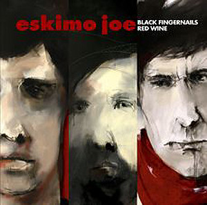
Despite what I feel about some of their earliest musical efforts, the band have always had a strong visual presence in regards to their album covers and music clips. The cover to 'Black Fingernails Red Wine' feels like a definite and positive continuation of the beautiful artwork incorporated in their previous release 'A Song Is a City'. The impressionistic, dark brushstroke aesthetic is quite appropriate to what you might expect to hear on the album upon hearing the first single (the title track in fact) with it's brooding, growing intensity.
That being said, a little bit of that treatment in both graphics and sound goes a long way. Unfortunately, in both instances on this album they overstay their welcome a little. The designers have decided to 'go for broke' with the cover painting and cut and spliced it throughout the whole CD booklet. The type treatment on the cover feels more 'marketing compromise' than design intent - almost like a guy in a suit and ponytail looking at the intended cover painting and saying 'They can have their arty shit as long as we make the title and artist name as chunky as possible! A more delicate approach to the type would have been more effective - in fact removal of the text all together, to be paced on the inside spine would have given the alum cover much more impact. The band sold 100,00+ copies of their previous album, they've got the fanbase there to purchase this one, they're big enough to get away with it.
In the final analysis, and after a couple of listens, I would say the artwork as a package reflects an album that initially offers a lot of promise, but unfortunately gets mired in it's attempts to prove itself worthwhile and deep but accessible to the major radio listener.


0 Comments:
Post a Comment
Subscribe to Post Comments [Atom]
<< Home