Revenge of the Graduate Portfolio 4

I never intended when I entered the Visual Communication course at The University of South Australia to become a graphic designer. I barely even knew what one was, let alone had any idea that is was something you could make a career out of, the careers course I took at high school still had 'ticket writing' as a job option for the individuals with artistic leanings wishing to apply their skills to the real world.
Through my life I like to draw, it was a past-time, but also something that I focused on as a future profession. While other kids wanted to be an astronaut or a race-car driver, I was dreaming of being a cartoonist, as I grew older and started to more seriously grasp the realities of 'real world' skill applications, I began to think that maybe I could illustrate children's books or at least be somehow involved in commercial illustration. It was with this some what vague plan that I applied for, and was accepted into The Uni of SA Bachelor of Design course.
At the time, (we're talking late 80s here) the course was set up so as both illustration and visual communication students did a two year combined foundation course (in the first year, all the design disciplines were pretty much combined in a foundation course, this included industrial design, ceramics, jewelry, human environments and graphics) so everyone got a grounding in the disciplines of both streams - typography, life drawing, graphics, photography, illustration, print-making, even wood and metal working - it was a pretty good system. After the two years, you split off into your preferred discipline, illustration or visual communication - it turned out to be a valuable system, because after that two years I discovered that concentrating on illustration wasn't for me.
A couple of things led me to that decision. I could see that while some of my classmates were progressing in leaps and bounds with their illustration skills, I wasn't progressing very far at all, my marks in illustration were just average, I was doing much better in typography, visual communication and even photography. I felt I had taken my illustration skills as far as I could at that point - or as far as I wanted to - I just didn't get along with the Illustration lecturers, it was all too close to 'visual arts', too unfocused and if there is one thing I have learnt about encouraging myself to 'create' - it's that I need an objective.
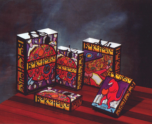
So I went over to the 'dark side' so to speak and took the visual communication stream, and for the most part, any inklings of being an illustrator fell by the wayside. The Bakehouse identity items you see above were my last gasp at any allusions in that area. To those in the know, you can see a strong influence from The Duffy Design/ Charles S Anderson style in the execution. Everyone else in the class seemed to be treating their identity projects so seriously, I just wanted to do something colourful and fun and momentarily recapture that spirit of enjoyment that made me first put pencil to paper when I was a kid.
As it turned out, in the long view of things, whether you chose to concentrate on illustration or visual communication didn't really matter that much in the real world. A lot of the illustrators found that their skills were much in demand in the studios and went on to successful careers as graphic designers (Matthew Remphrey of Parallax Design studied illustration).
It's unfortunate that the Uni of SA doesn't do the combined foundation years anymore (at the moment though, that's probably the least of their problems, don't get me started) because for myself at least, it let me sort out what I really wanted to do. Through the years I've incorporated a few illustrations into the work I do, but I wouldn't list it as one of my major skill sets. I still have a certain fondness for that pink dinosaur eating the cookie though :)


0 Comments:
Post a Comment
Subscribe to Post Comments [Atom]
<< Home