Interview with James Hancock

Previously I have reviewed the beautiful album artwork for Josh Pyke's 'Memories & Dust', I was so enamoured, I decided to get in touch with the artist, James Hancock, and throw a couple of questions his way regarding his work methods, ideals and ambitions. He's currently on a bit of a world jaunt, but he's kindly answered, and the interview follows below.
A bit of background on James from his bio. James is based in Sydney, Australia. His work draws together elements taken from found objects and hand-generated content from a variety of media such as drawing, collage, printmaking and painting. His work projects a naievety, and seek the fantastical and cute in explorations of the realness of objects and emotions and their macro and micro processes. He also explores animating his world into video works. He runs his own graphic studio and has exhibited in Australia and internationally. He is also very active as a curator of exhibitions of national and international work as part of the SPACE3 collective, which connects him to a strong creative community.
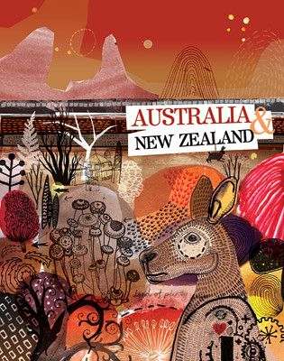
Chris Bowden: When did you first decide to become a designer. Was there a proverbial 'pivotal moment'?
James Hancock: Not sure there really was one, and not even sure I'd class myself as a straight 'designer'. I've drawn all the time, by myself, with other people, I've gone through design university which satisfied one part of my personality, but I also took subjects at art college and have always found myself somewhere in the middle of art and design practices. I consequently have loved people that are between disciplines; writers that draw, musicians that paint, collectors that make sculpture. I wonder if the 'pivotal moment' was the moment I accepted this dychotomy within myself.

CB: Who or what inspires you at the moment?
JH: I am consciously influenced by outsider art and ideas of hoarding and psychology. This outside observation of the world and psychological analysis of internal worlds.
Contemporary artists like Julie Mehrtu, and sculptors like Nancy Rubins, and conceptual artists such as Jennifer Allora and Guillermo Calzadilla - google them, they do some really fun stuff. I find it much more inspiring to look at things outside of the graphic design world. I get easy sucked into trendy aesthetics and I feel much more satisfied if I draw my creativity from a personal world of experiences rather than referencing current design trends. I'm moving around the world a bit at the moment, with studios in different cities, trying to make work on the run, and I really think this studio-in-transit and being around new environments means I constantly re-address what it is I do. Sometimes this stops me doing anything at all, but I always come back to drawing as the basis of everything, as a way of releasing the buildup of creative need.
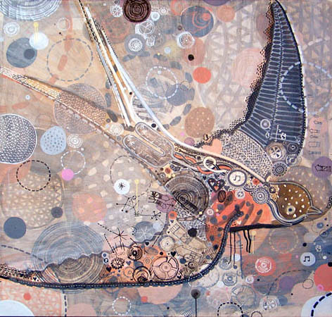
CB: Which of the projects that you have worked on in the past are you most proud of and why?
JB: From my client based work I guess the Josh Pyke stuff really stands out as a solid project, with print, animation, and new media applications all working together. This project also started an approach of applying a personal art practice to a client based project.
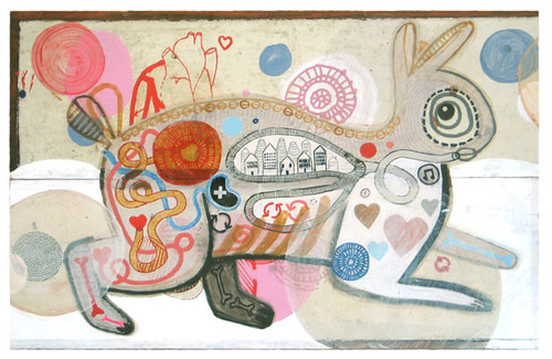
CB: Could you discuss a little about the work you've done for Josh Pyke, how it came about, the process, how much freedom you were given?
JB: I'd recently come back from an artist residency in Indonesia and was drawing all these people in a naive anatomy style, revealing the congestion and pollution and density of humanity I experienced there. So lungs contained buildings, crowds walked through the hair, and cars drove through the veins. So then when I came back to Sydney to work on Josh's first release I started reading the lyrics and saw all these references to things jumping through each other, holes being cut in each other, there was this grotesqueness to it, but on a cute kind of vibe. So after some initial sketches and talks with josh I started doing all these little animals with their insides showing little hearts and music inside. It was a real flow on from my artistic practice of the time, it also lead me to do more works on the theme on a larger scale, big canvases. These graphic elements then flowed on to other releases including the latest one, where it has all exploded outside and the new albums imagery of buttons and sewing stiches together a big mammoth plan. Kind of like an obsessive document, where an outsiders mind is pulling together all these ideas and making a big mind map on the table, using old craft techniques of sewing and stitching to pull it all together. The first album was relatively free, but of course as Josh became more well known there were more people interested in how the album art turned out so the recent album release had much more label involvement integrating his photo on the cover for example. Luckily it didn't get pulled in too many directions and came together as a very neat creative package.
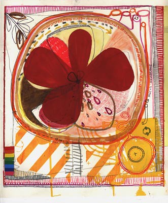
CB: You have a very individual style in your work which has been used across a range of promotional items for Josh Pyke's Memories & Dust from the album to posters to film clip etc. With the album being such a success, do you have any concerns that that style will now be seen indelibly as part of Josh Pyke's image?
JH: I actually like it when artists works become recognisable through a music release, it provides people with an access point for people's art and the symbiosis of two creative individuals (art & music) coming together can be really interesting. I like it that behind music releases there is also this visual artist that is audibly silent but has their own creative voice on there, so the album speaks across two senses. This chain of creativity is great, and I always enjoyed finding out about artists through cd cover work. It can be a great promotional tool for the visual artist if the CD is successful, but it's not only a promo tool, it is two worlds coming together. A CD can be a little world when it works really well, a glimpse into all the artists involved, their world. I think my creative world is strong enough to stand within other creative worlds and still retain it's own identity, I think this is where coming from an artists perspective is important because you are not solely motivated by the client but by your own processes as well. This is what joins the two creative experiences together but also what separates them.
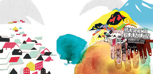
CB: You've done a few album covers, any artists you would absolutely love to do work for?
JH: I'm keen to work for any artist, I'm constantly making work and really love applying my world to the world of other creative people. I'm not sure it would be any different (apart from budget) working for bigger more famous artists.
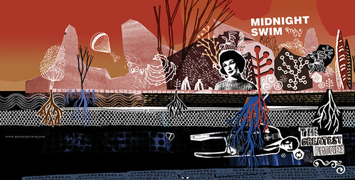
CB: What are some of the things you do to keep yourself motivated?
JH: As I said before I really get a lot out of looking at other people's creative worlds. Jealousy of those worlds sometimes spurs me on to create something like what I like, but inevitably I create something of my own from that inspiration. Again I think the contemporary art world is great for this, where you deal with abstract and alternate views people have of the world. Objects and images that change the way you think or see, this is what keeps me motivated. At the moment I am surrounded by a friends amazing library, so I am reading and reading and the links I make from this in psychology, biology, fiction all serve to motivate me in new directions.

CB: How do you approach a new project? How do you overcome the 'dreaded blank page'?
JH: I don't really feel like I ever have a blank page, I always have images I have previously made around me, in sketchbooks, photographs, reference books etc. There is always a pile of imagery I like to sort through and draw from. I have a folder on my laptop with heaps of scans of drawings and collages I've made in the past that I draw from all the time. I really like Gerhard Richter's 'Atlas' project where he has organised all his reference material into one book - this kind of obsessive collecting really appeals to me, it almost strives for an end to imagery, to finish collecting, finish seeing. Then this contrasted with Francis Bacons studio chaos where there is a realisation that imagery will never end and juxtapositions of images amongst piles of images will constantly make new narratives and statements. I think collage is an amazingly powerful process for building narrative and generating ideas, simply by placing images next to each other. I sometimes am stunted by the realisation that the blank page holds the opportunity to go in infinite directions. This can be overcome to some extent by surrounding oneself with images that act as starting points. The infinity of the blank page is then reeled in by a process of accepting or rejecting what you have at hand at one particular moment.
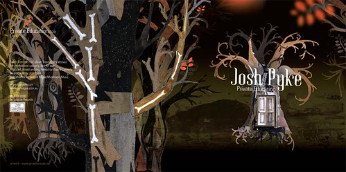
CB: What project and, or client that you haven't worked on would you love to and why?
JH: I would love to have the opportunity to work with someone with unlimited budget, to be able to do all the things with printing and cross media integration that I'm not really able to because of cost. To do things like get origami folded by hand for cd covers on a small Japanese island, to make sculptural objects and installation sets for photo shoots in the desert... There are these amazing massive prop lots for film and advertising in LA I'd love to be able to go in there and make worlds from what they have. I remember going into the dungeon at the PowerHouse museum in Sydney and looking at their collection... thousands of toy cars, and old science machines, and bits of rocket, and typewriters, I'd love to be able to play with all that stuff creatively. Maybe I just need a massive house so I can start acquiring all this stuff, start making a set to live in that I can introduce other creative people into and work that way?... hmmm...
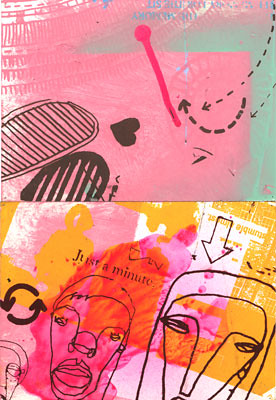
CB: What music have you been listening to lately?
JH: Just saw a Bjork concert in San Francisco, amazing live show with a brass band and super electronic triggering and improvised jazz drumming, like a weird, creative school concert! also myspacing LA artists such as Lenka and The Bird And The Bee.
Thanks once again to James for his time and generosity. I'm sure you will be hearing about him and seeing a lot more of his work in the future. You can see more of James's work here at his website.
Labels: album cover, artist, graphic design, Illustration, James Hancock, Josh Pyke, Memories and Dust, Music graphic design


1 Comments:
Keep up the good work.
Post a Comment
Subscribe to Post Comments [Atom]
<< Home